Steele's Cookies is a boutique custom cookie-maker located in St. Paul, MN.
Sarah was starting from scratch—no logo, no brand materials, no web site—and entering a market saturated with competition from home bakers to professional kitchens. Her only presence up to this point had been posting photos of her cookie designs on Instagram.
Research
Steele's Cookies operates under Minnesota's Cottage Food Laws, as do all "home bakers" who want to sell their cookies. These laws dictate how much a home-based bakery can earn before stringent food handling laws come into play. They also restrict where and how the business owner can sell their goods—for example, they are allowed to have a web site and even sell at local markets, but they cannot legally ship cookies.
This means that until Sarah decides to expand her business and take the steps required to obtain a food handling license, her only competition is in her immediate market.
This is important because these limitations dictated which components of her brand package would need to be created.
Audience & Strategy
Steele's Cookies already had a decent social media following prior to contacting me. Her audience is national but her customer base is entirely local and her followers regularly engaged with her posts on Instagram. The vast majority of her customers are looking for custom cookies for special events, but she's also provided catering for larger organizations and gatherings.
Growth isn't a real concern as long as Steele's Cookies remains a Cottage Food business. In addition, volume is limited by the physical dimensions of her kitchen. The strategy is simple: Maintain brand consistency across marketing materials, social channels, and web site until such time that bigger next steps are taken.
Simply creating a cohesive brand package would put Steele's Cookies ahead of 92.153% of her competitors. My job was to elevate that to 99.9% and create a system that made the whole process as inexpensive as possible and easy to maintain.
Brand Development
There are a many dozens of small cookiers in Minnesota, some have logos, some have packaging, some have web sites, some exclusively rely on social media to sell their goods. Nary a one, not even the most popular home bakers, had a well thought out identity.
A quick look around the interwebs revealed mostly awful logos with zero consideration for anything beyond a logo. What I found were a couple consistent design trends within the cookie-making community: 1) lots of text-based logos with handwritten fonts and 2) lots of people trying to illustrate a cookie.
Side note: I don't know if you've ever attempted to illustrate a [chocolate chip] cookie, but it's not easy. Most attempts wind up looking like a lump flecked with tiny turds.
My approach was straight forward: Avoid the obvious and create something unique, and above all, make it as cheap to produce and flexible as possible.
Logo
Sarah has an amazing personality and I wanted to bring that personality into her brand's identity.
The obvious approach was to try to create a logo based around her last name: Steele. This lead to the quintessential kid with his "hand in the cookie jar" trope. My first attempts were largely failed experiments in trying to create a visual that didn't look weirdly alien.
I didn't like the direction, but I saw something in this that solved the problem for me. Among her posts on Instagram was a batch of animal cookies she had created for a special event. I set about creating a set of animal illustrations pulled from her cookie designs.
Next, I created a label graphic to tie everything together. I wanted to create a patch-like label that wasn't a circle. A bowtie shape worked best because the natural flow of the shape leads the eye from the outside in focusing attention on the artwork "cookie". It also allows for flexibility if the vertical dimensions of the artwork are not consistent (look closely and you'll note that the deer design is slightly taller than the other designs.) I selected a type face that was easy-to-read and fun but not comic-y and placed it on a slight curve to further help focus the attention down or up. The final designs are super cute and completely different than anything else I have seen in the cookie space—Since the artwork is pulled from a cookie cutter, bonus points for imagery relevancy.
In this instance, I worked backward from the label graphics to create the standalone type logo for the business. I pulled the color from the label artwork to create a simple, effective, and fun mark.
The final logo sheet includes a number of other bowtie designs featuring cookie art, including the stars at the bottom of the page.
Two primary points to note about this solution:
1) It works just as well in black and white as it does in color—Nothing is lost when color is removed.
2) The bowtie design opens the door to an infinite number of potential graphics moving forward. I can continue adding new designs featuring her cookie art at any time and it will always work with the brand identity.
Visual Language
The font I chose to represent the brand in print is a fun letterform with a handwritten look, no sharp edges, and is thick enough to be readable at small scale. I coupled this with a color palette consisting of muted tones that strike a balance between intense color and pastels.
Brand Support
Business card with multiple back options
Ingredient sticker for packaging (mandatory, per Cottage Food Laws)
5" die-cut stickers to be used for labels on 8" to 10" cookie box tops.
"Thank you" postcard
Product Ideas
Web Site
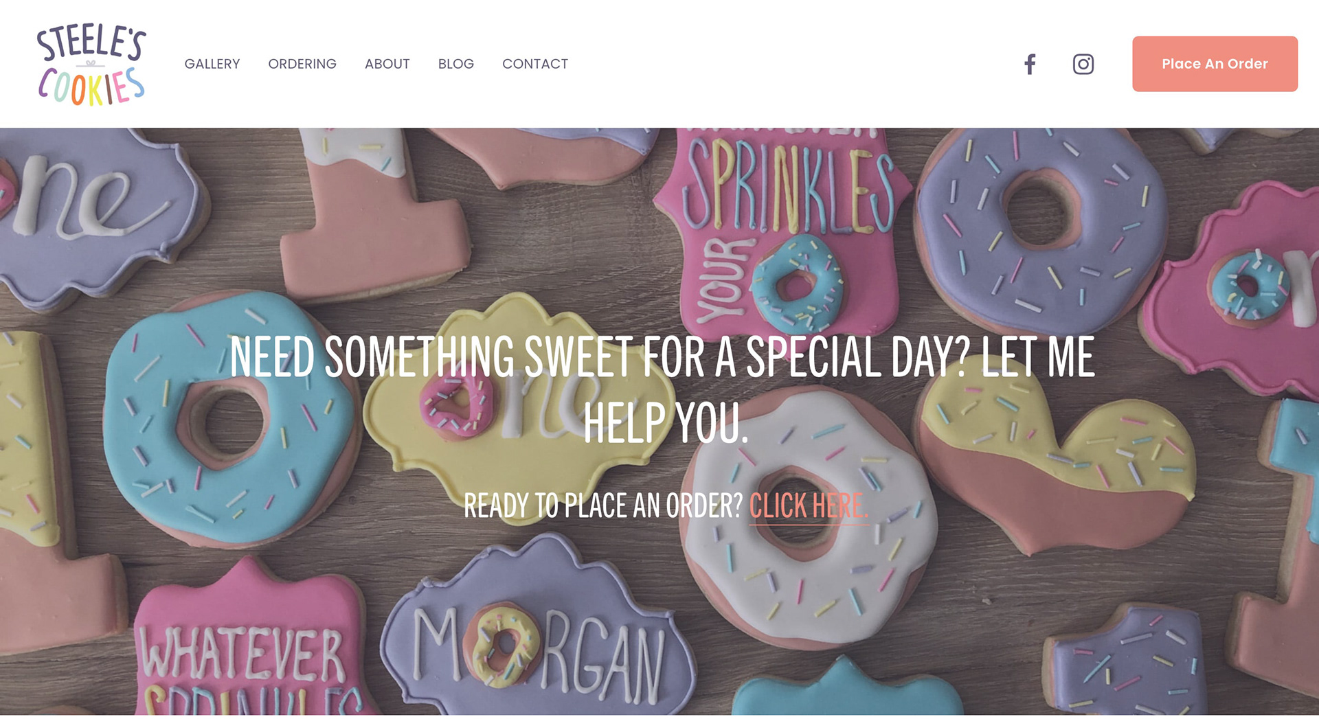
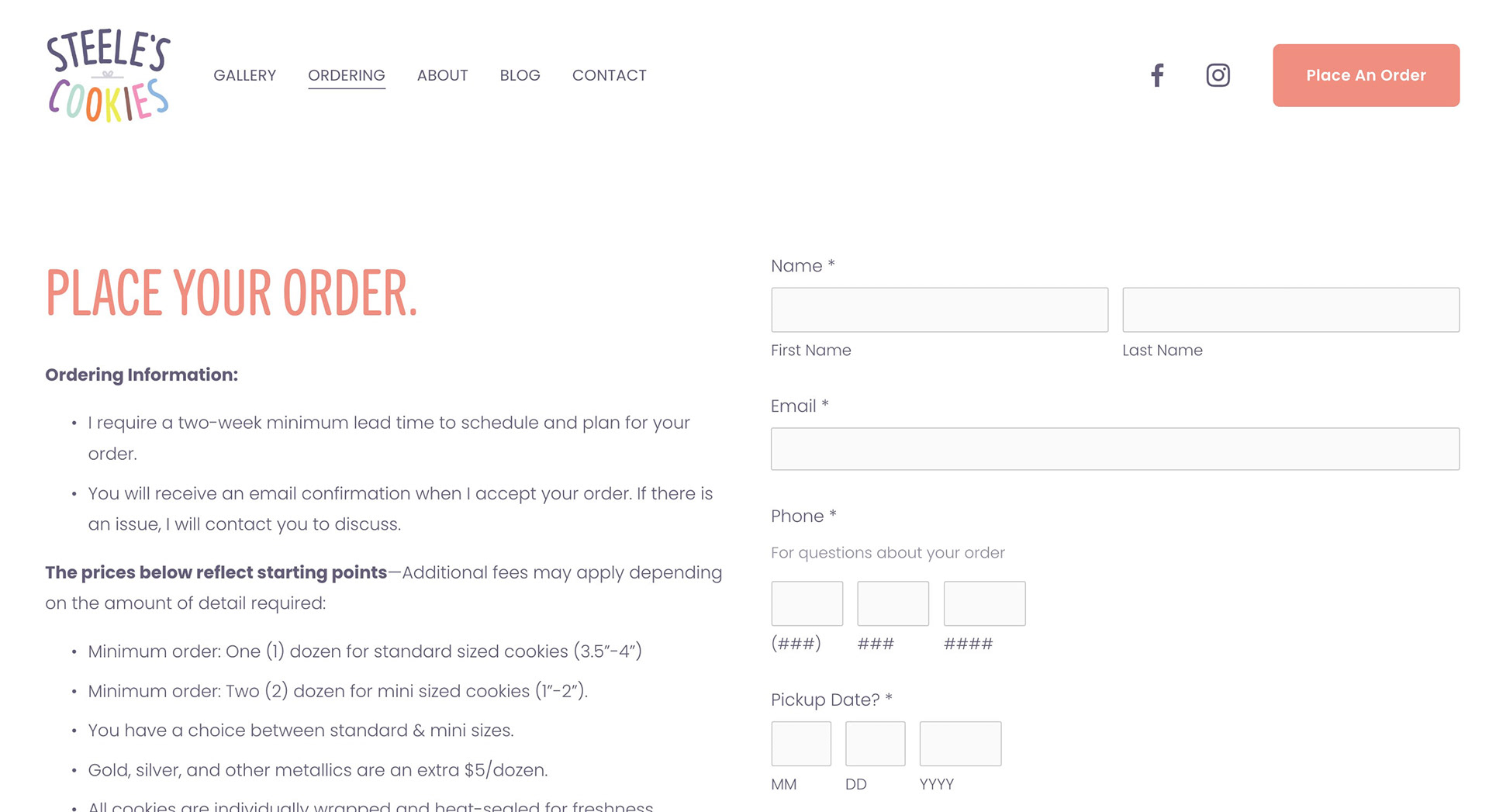
The web site was built on Squarespace and functions as a platform to take orders and introduce customers to Sarah's cookie creations. As mentioned earlier, since shipping is not a legal option, the cart is limited to pickup orders only and customers are able to select a pickup time from a pop up menu prior to placing an order. After the order is placed, customized automated email messages provide customers with pickup instructions.
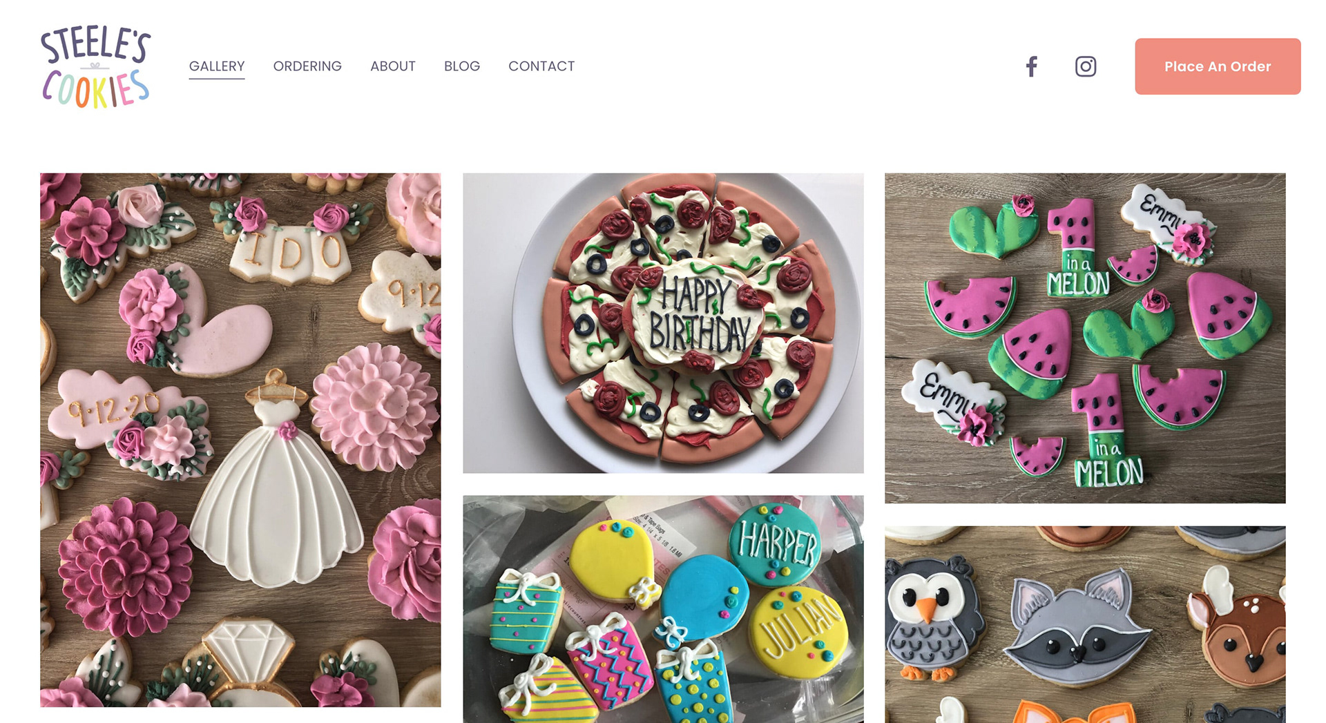
This is a simple web site with a simple purpose that can be summarized in three phrases: "Hi, customer!", "Look at what I can do!", and "Would you like to place an order?".
The navigation is straightforward and the two most important pages on the site are the easiest to find: On the Home page banner, there is a link to the order page and below the banner a customer will find categorized cookie events ideas and a direct link the gallery. The remainder of the site fills in the "who" of Steele's Cookies.
The web font being used on the site is a similar condensed typeface that mimics the look and feel of the print font and the color palette is limited to orange and dark purple to allow the photography to shine.


Small companies need just as much help creating unique brand solutions as large companies. The challenge is determining which pieces of the puzzle can be created within very limited budgets. My solution for Steele's Cookies checks every box necessary for a unique and effective identity package in a very competitive niche market.