Loryka was a ground breaking tool developed by entrepreneur and programmer Justin Shattuck. In his own words, Loryka is "a platform and data pipeline that allows researchers to gain insights into the attacks we see [on the web]."
Justin brought me in to help him rebrand a product and web site that was thrown up to woo investors. The goal was to create a logo and mark that visually represented what Loryka was all about—a tough sell given the amorphous nature of the product.
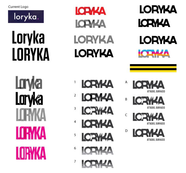
The original logo (below) was a simple sans serif typeface with no particular value other than it was the font he used to get a sales site up quickly. The mark gave no indication what the company was about or what the company did.
There were only two design requests: 1) a sans serif font was preferred and 2) lower case text, if possible.
Concept
Loryka derives its name from the word "lorica segmentata" which is a type of personal armor used by soldiers of the Roman Empire, consisting of overlapping metal strips fashioned into circular bands, fastened to internal leather straps (Virtually every movie you've ever seen with Roman soldiers features this type of armor.)
Justin and I spent a lot of time discussing his vision for the brand. In describing the detail that his tool could produce, he focused on a forest analogy: "Picture a forest, see how the leaves and beaches sway in the wind, then focus on a tree and look for birds, squirrels, and critters among the branches, then zoom in on the bark, maybe you find moss, but watch for movement from ants, beetles, and bugs. What are the ants carrying? Zoom in on an ant and see the bacteria hitching a ride on its back."
"That's the level of detail Loryka can achieve in identifying web security threats", he added.
He also described the project with phrases like "forest AND (not 'for') the trees", "circle of life", "everything is related", and "taking the PH of soil".
Brand Strategy
The intention with Loryka was to do one of two things: Obtain VC funding or sell the tool outright. In other words, the entire purpose of the rebrand was to help improve the tool's chances for sale.
Logo
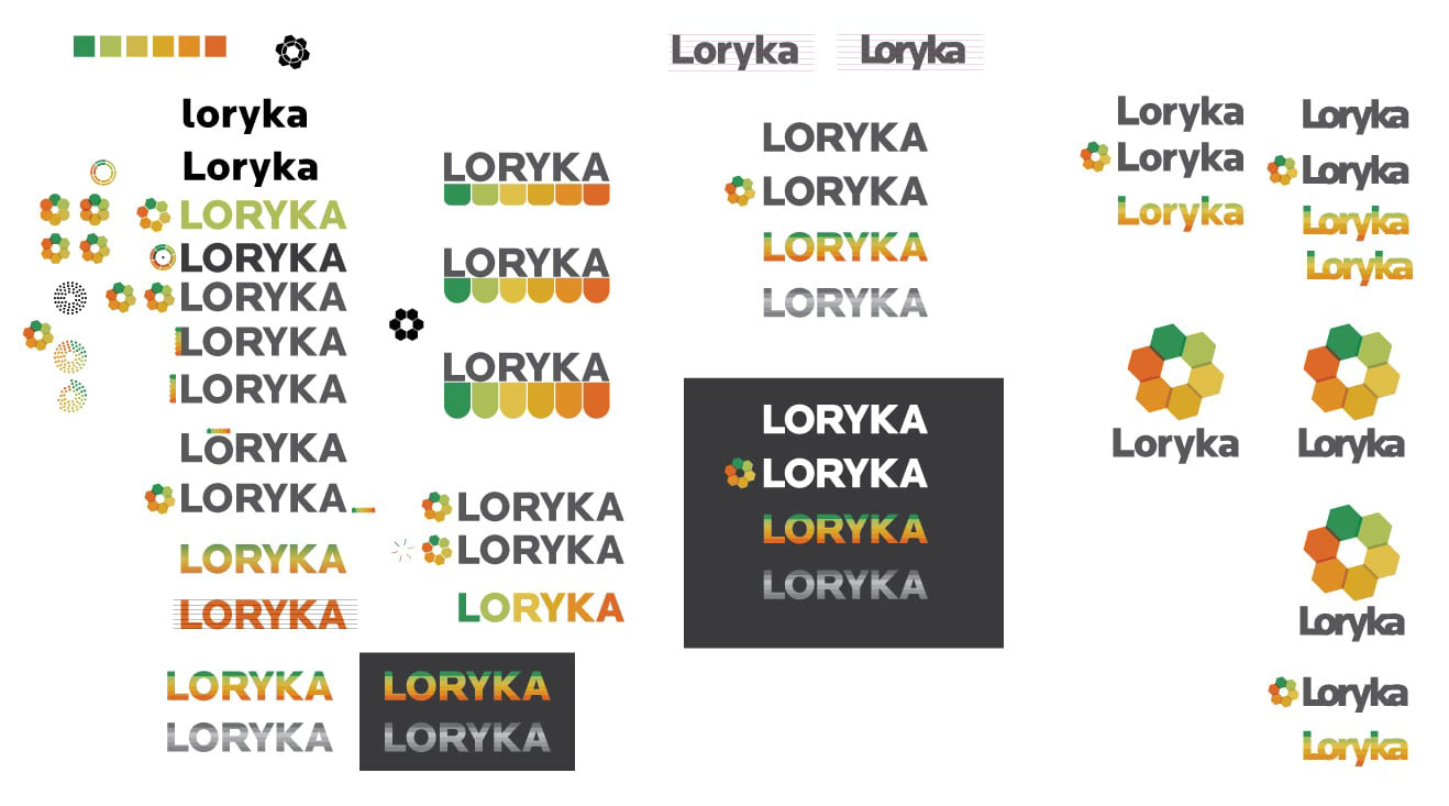
Initially, I chose a san serif font with enough bulk simply to noodle around with different ways of visually portraying "overlap". I spent a lot of time working through the idea of lorica segmentata with different methods of overlapping type forms. None of these initial explorations met with much success. Then I began playing with various graphic queues utilizing horizontal lines, scales, and hexagonal shapes—pulling in the PH scale and beginning to explore the idea of "circle of life" with shapes connected around a circle.


My brainstorm came with revisiting the idea of “taking the PH of soil”. I wanted to find a way to speak to the forest analogy without using natural imagery or anything like PH probes. In the end, the solution that presented itself was bloody simple.
For the icon, I moved away from trying to portray overlap and focused more intently on the "circle of life" direction.
The final word mark checked all of my boxes—I wanted to keep the logo readable, elegant, and strong. After tweaking the shapes, everything started to come together. In addition, the font I chose is a san serif font that has just enough flare to make it unique but still look very professional. Finally, I boosted the saturation of the PH colors to help pop the logo.
My solution covers a wide range of ideas related to the product:
1) Overlap: “Touching” letter forms speak to connection, connectivity, and "everything is related."
2) PH: The color palette is the PH scale.
3) PH text: Color bars represent PH scale—speaks to layers of data, stratification, science and precision, and hints at the definition of “lorica” armor (perhaps, a stretch).
4) Icon: PH scale—Speaks to the "circle of life", connectivity, natural building blocks, and foundation. It is also a direct analogy for layers of data being transmitted and the dots diminishing and changing color as they move around the circle hint at the tool's ability to identity the malware needle in a haystack.
Visual Language
I spent a good bit of time searching for the perfect font. The winning font, called Locator, allowed for a degree of overlapping the text forms without losing the integrity of the individual letters when the leading was reduced. Plus, an added bonus was that it turned out lowercase letter forms were ideal. Locator was also available in multiple widths and as a web font.
As I've noted above, the color palette is the PH scale with more vibrant hues.
Brand Support
The only piece of the brand package that wound up getting produced was the business card.
In the end, these efforts were so successful that the company sold within months of the rebrand. It all happened so fast that the web site never even got built. I'd like to think that my efforts helped facilitate the sale, but the tool itself was so incredible that it could have sold in a paper bag labeled with a Sharpie. It was a fun project ... Just wish I would have had stock in the company.