My proudest work: I was part of a team of three (myself, Chad Crowell of Swish Digital., and Casey Reid of Clearfire Inc.) who overhauled the website for INSTAAR, a research center at UC Boulder that processes massive amounts of scientific data and presents a metric ton of it on their web site. The depth of this website is staggering and our job was to update a first generation content-managed site to be able to present a library's-worth of information to researchers, scientists, scholars, students, and the public in an approachable, easily accessible experience.
The three of us collaborated in-person with a hand-picked board consisting of managers, scientists, and grad students to work through all of the foundational aspects of the redesign and development before we were sent off to work our magic.
My role as UX/UI designer was to completely redesign the user interface and user experience—While there have been some cosmetic and functional changes since this project was completed, my work remains active and fundamentally unaltered nine years post-launch.
Audience
Content, not simply content layout, was a challenge because much of it was written for other scientists and not for the public. The reason this was important was because, at the time, INSTAAR's budget had been halved and including a means for the public to engage, participate, and donate to the organization was crucial for its survival. One of our biggest challenges was making this amazing scientific organization accessible for the average person and to do that we had to find a way to make it more personal. This meant working with the staff to rewrite headlines and simplify the textual content enough in high traffic areas like the outreach section for non-scientists to understand what they were reading and how the research impacted their daily lives.
For the first time in their history, INSTAAR would be relying on public funding by way of donations to support their work. This meant creating a well thought out process for users to engage online that dovetailed directly into their marketing strategy and outreach events.
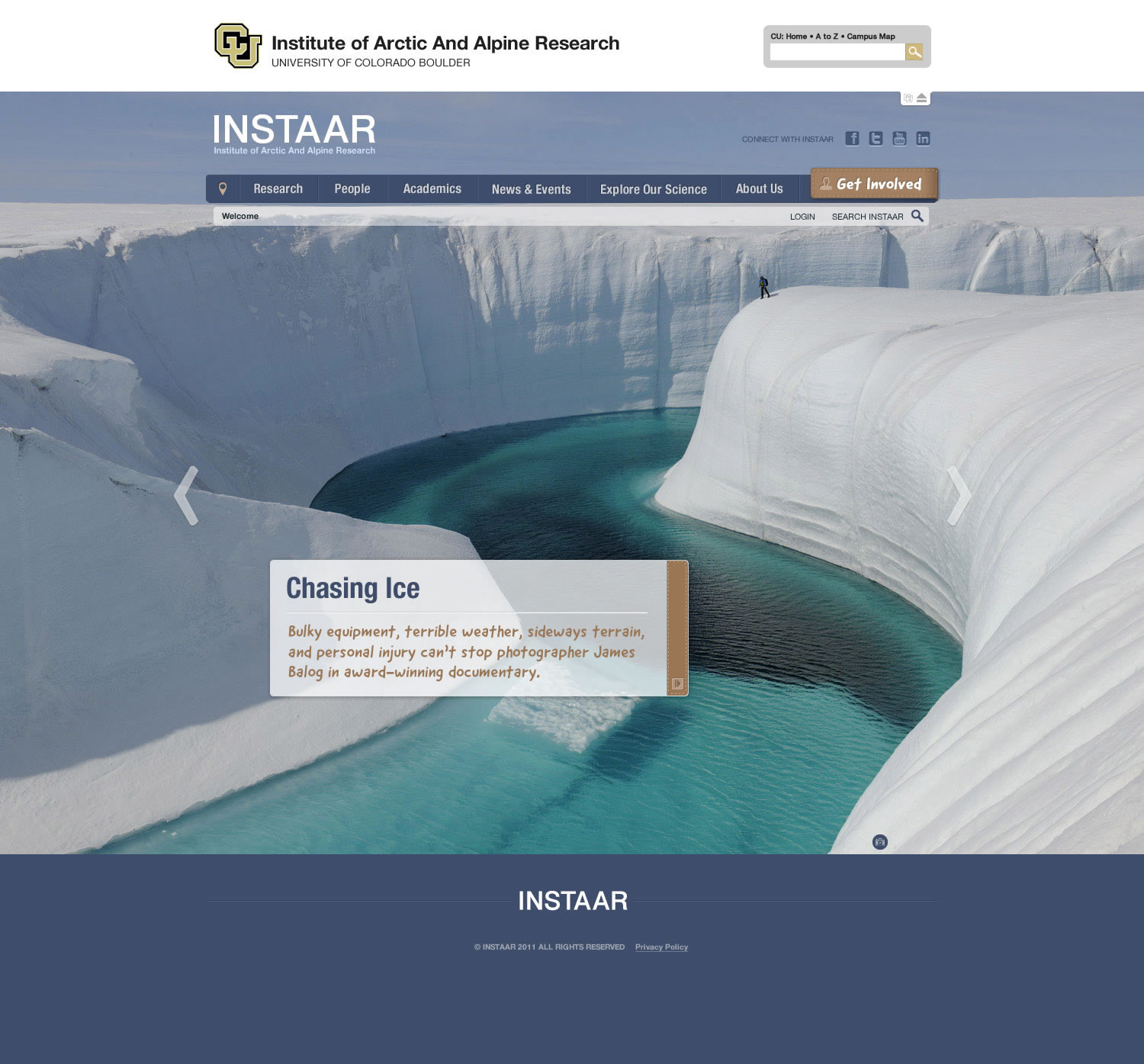
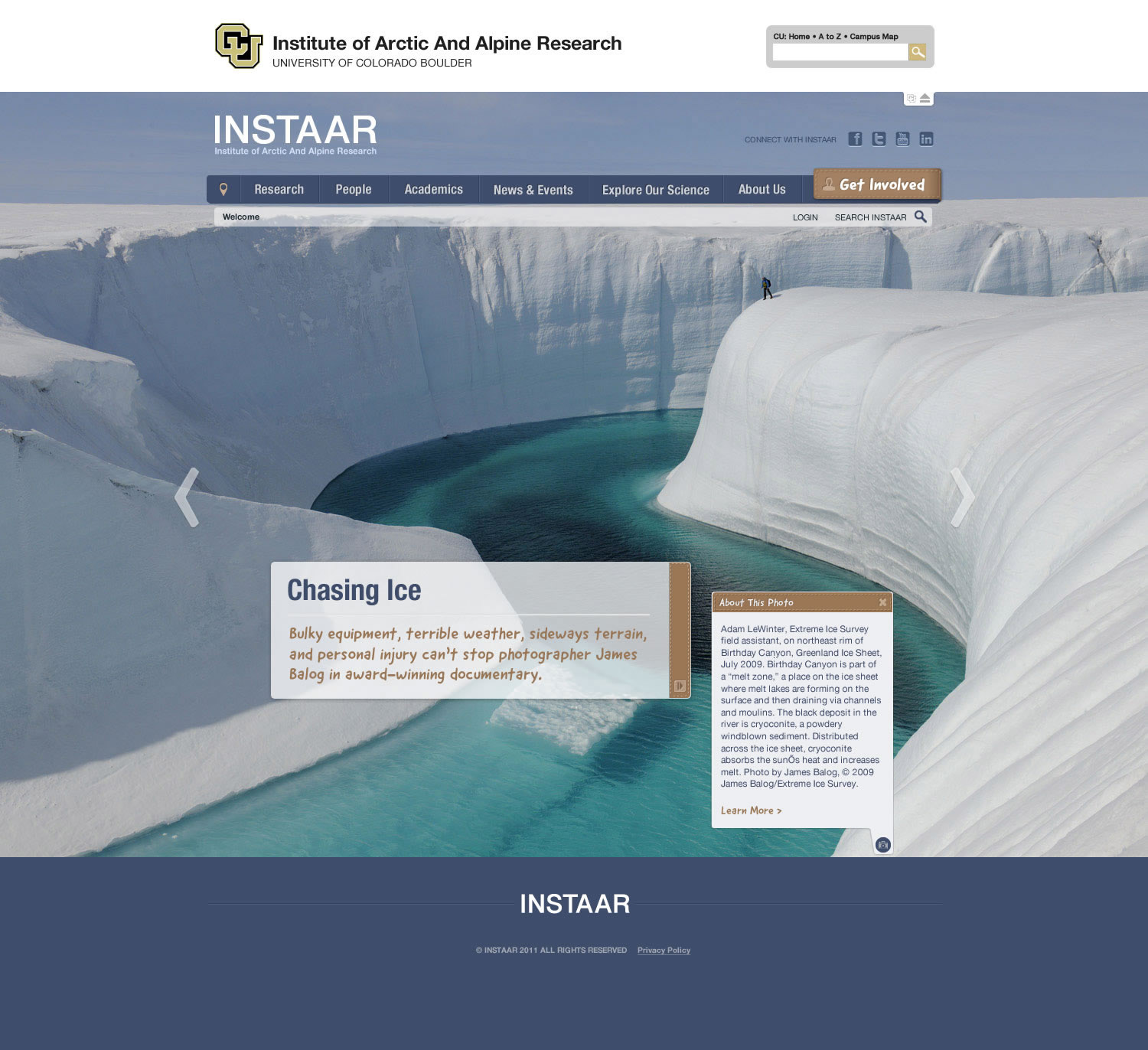
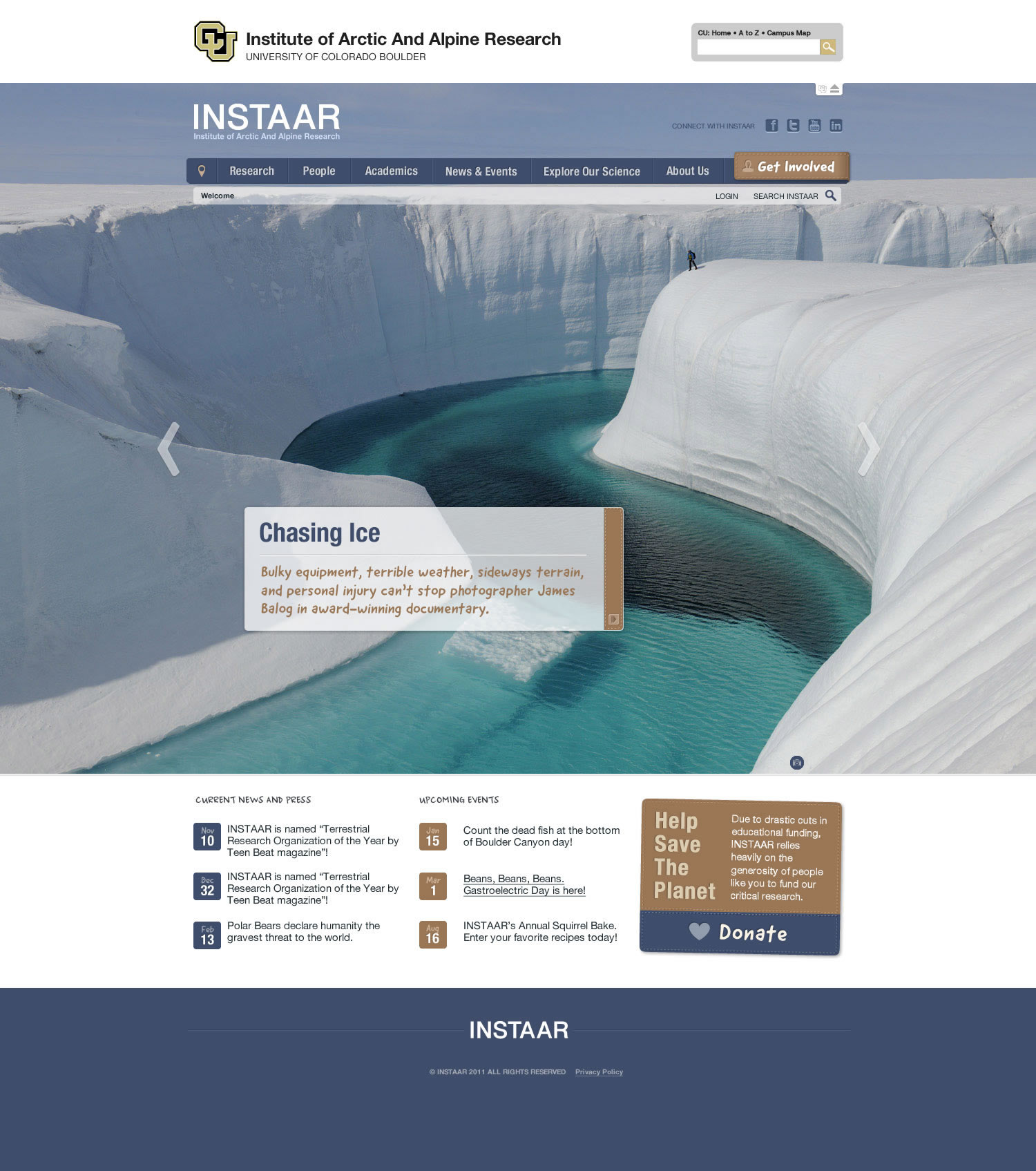
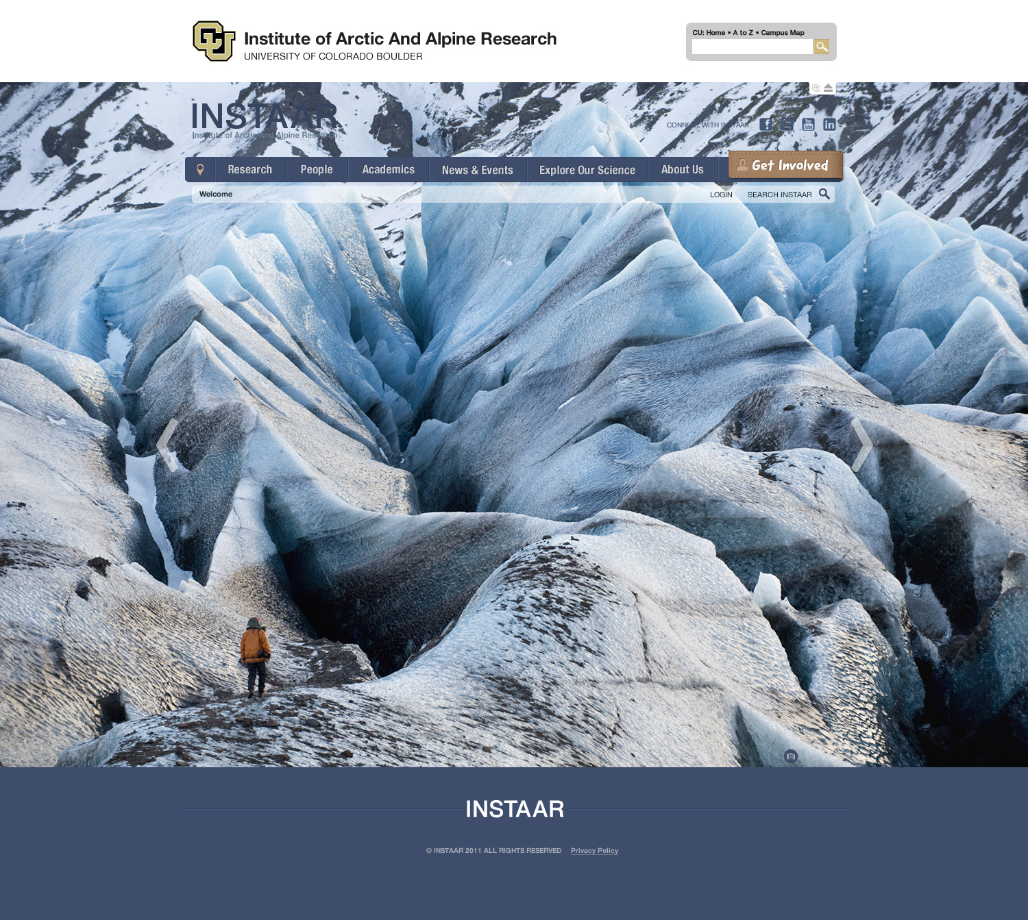
You want to wow your audience? It helps to have a deep reservoir of shockingly incredible photography at your disposal (a designer's dream). Photography was the undisputed champion in the redesign—My entire design was created to work as an unobtrusive accent to the visuals.
One of my ideas was to use CSS to manipulate the placement of the text/informational block in the home page hero image. We built into the CMS a simple tool that allowed site managers to select from seven different placement options depending on the image they chose—left, right/top, middle, bottom, and no block.
Side note: All of the photography used in the web site was taken by INSTAAR scientists and researchers while on location—absolutely stunning work from some immensely talented amateur and professional photographers.
Navigation
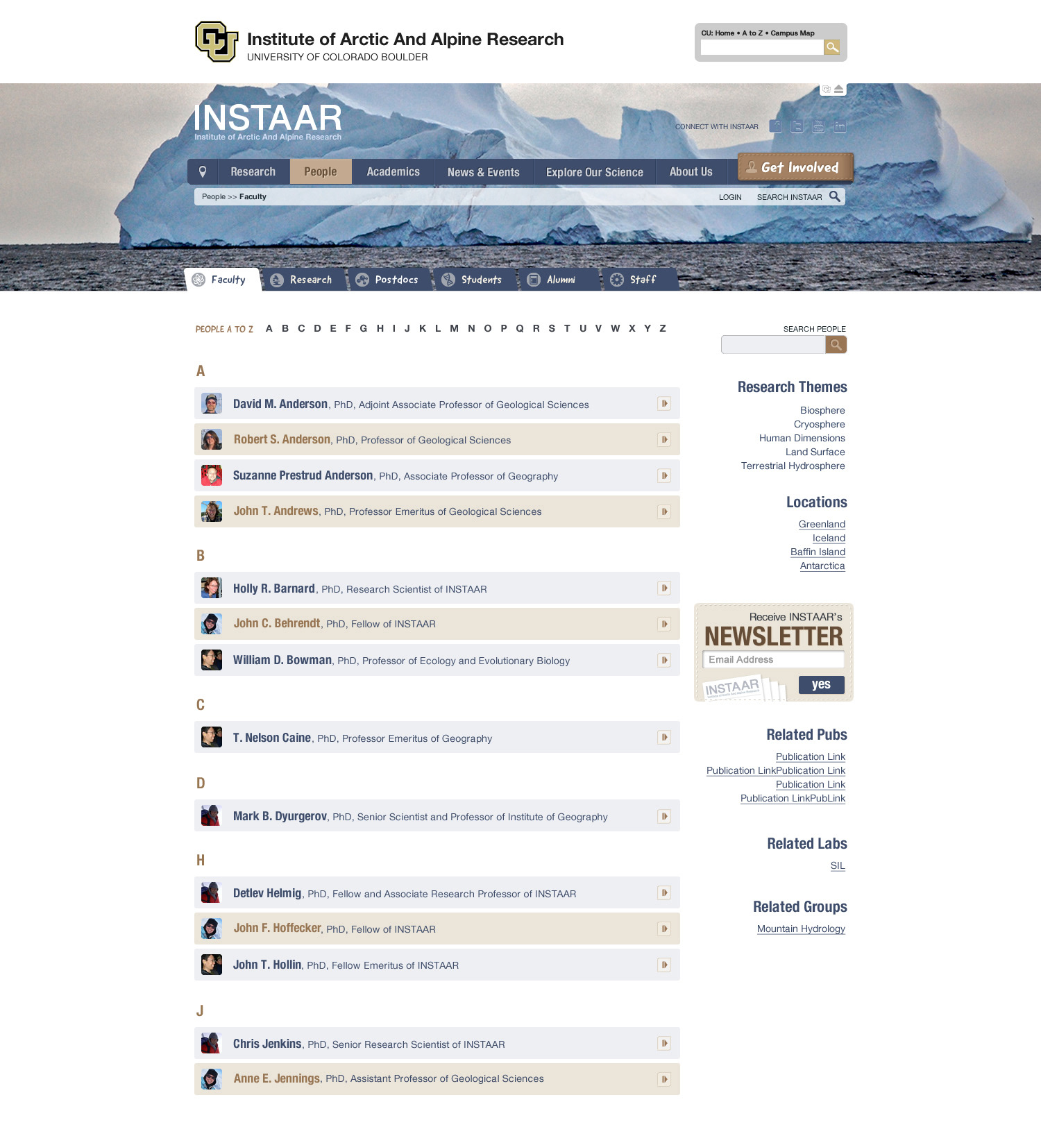
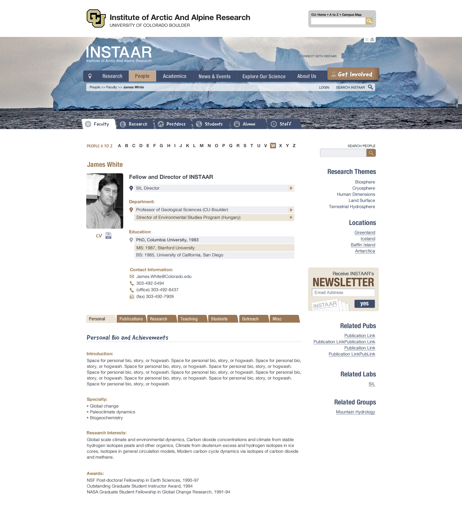
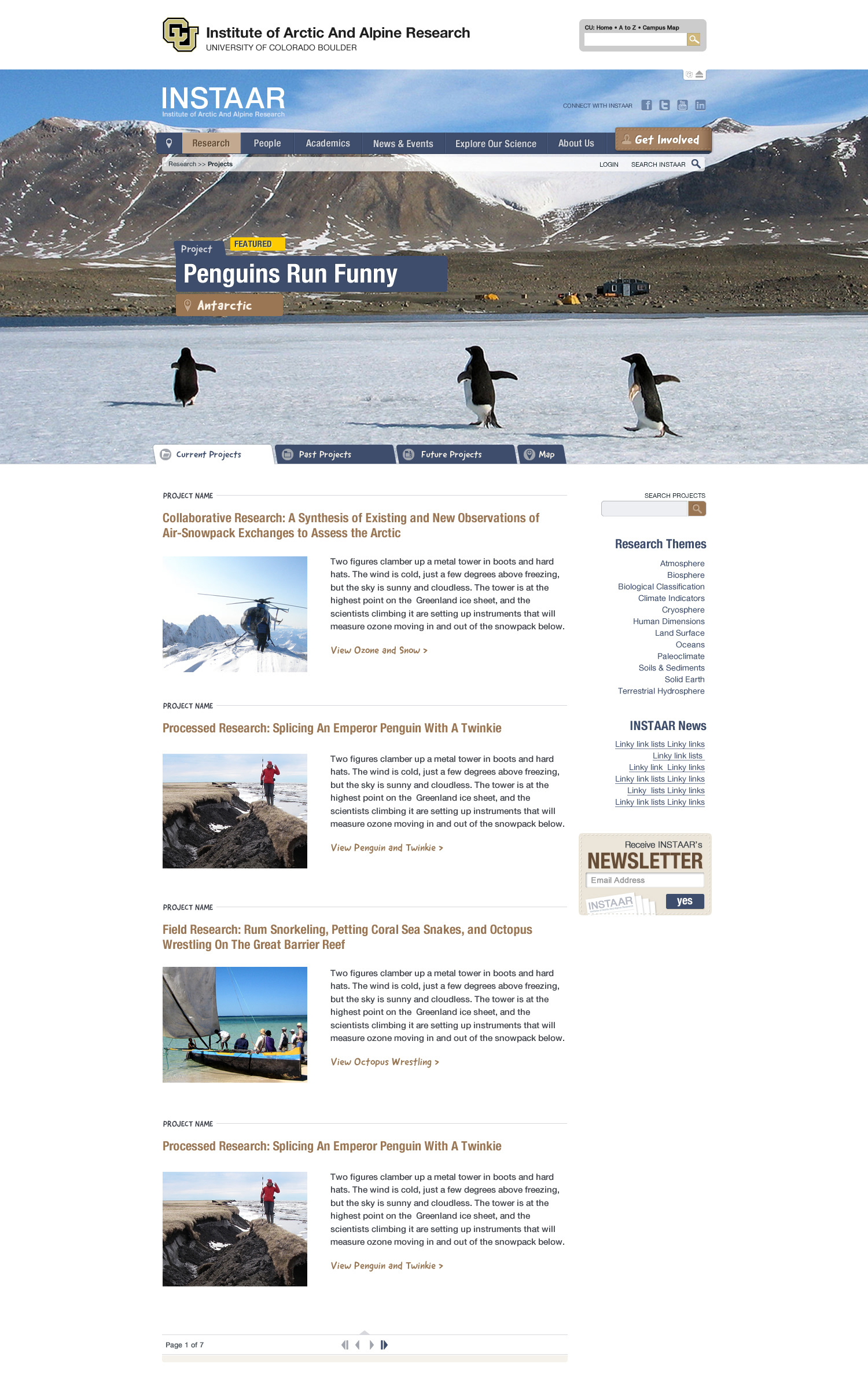
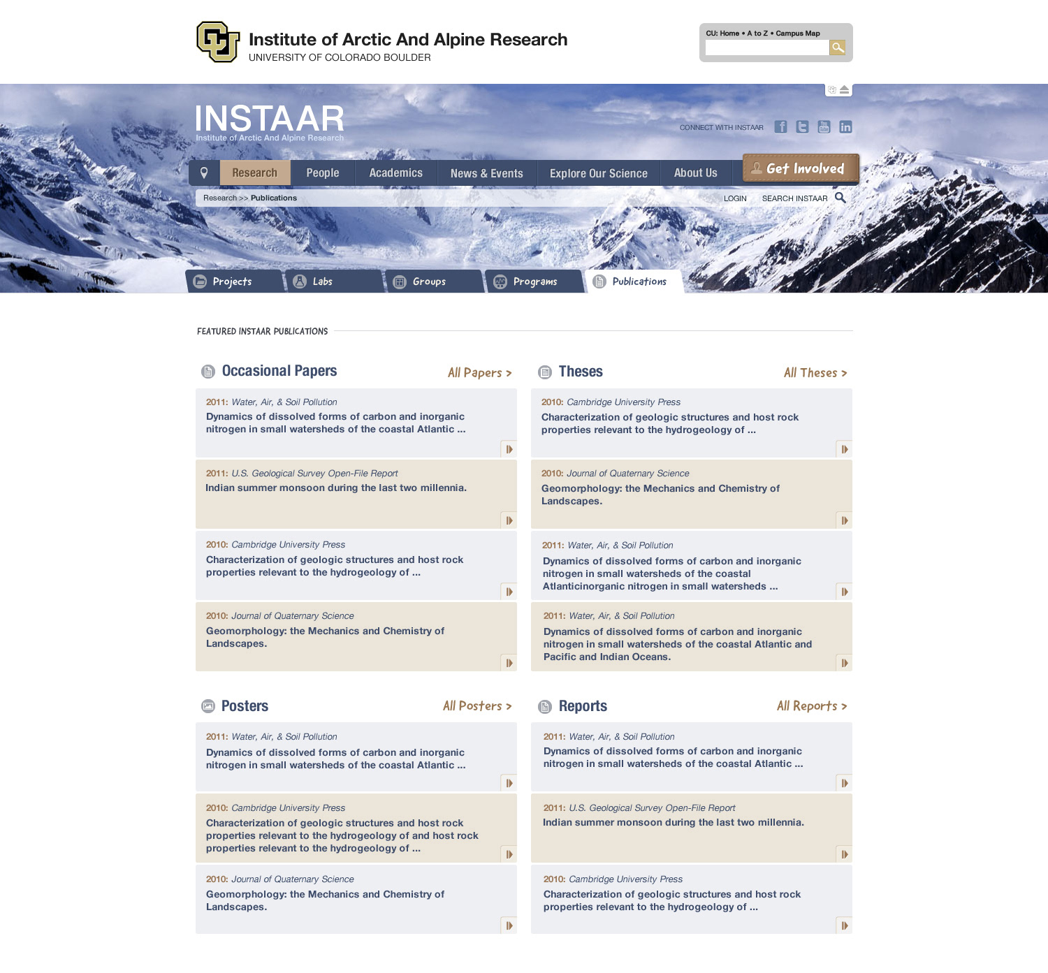
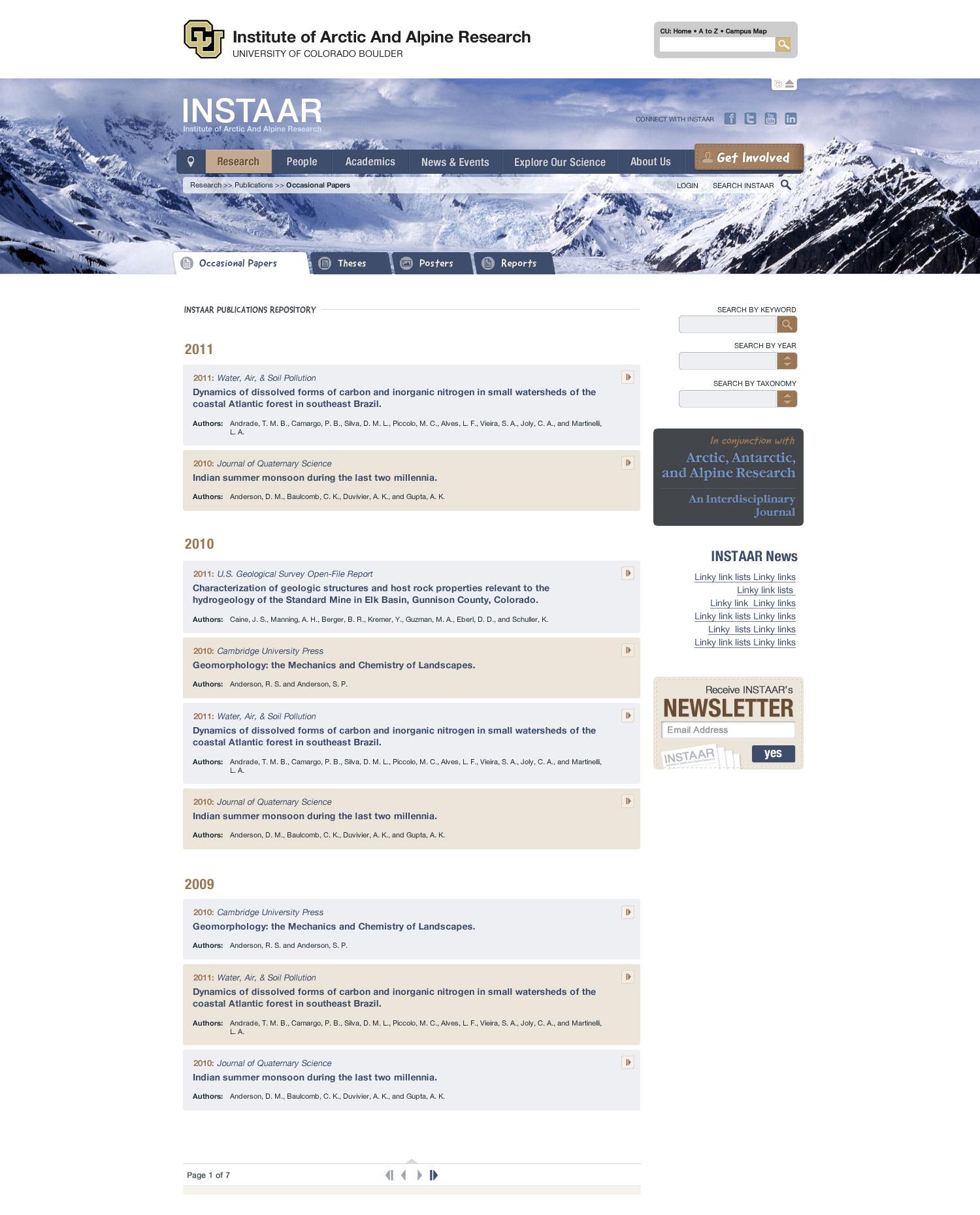
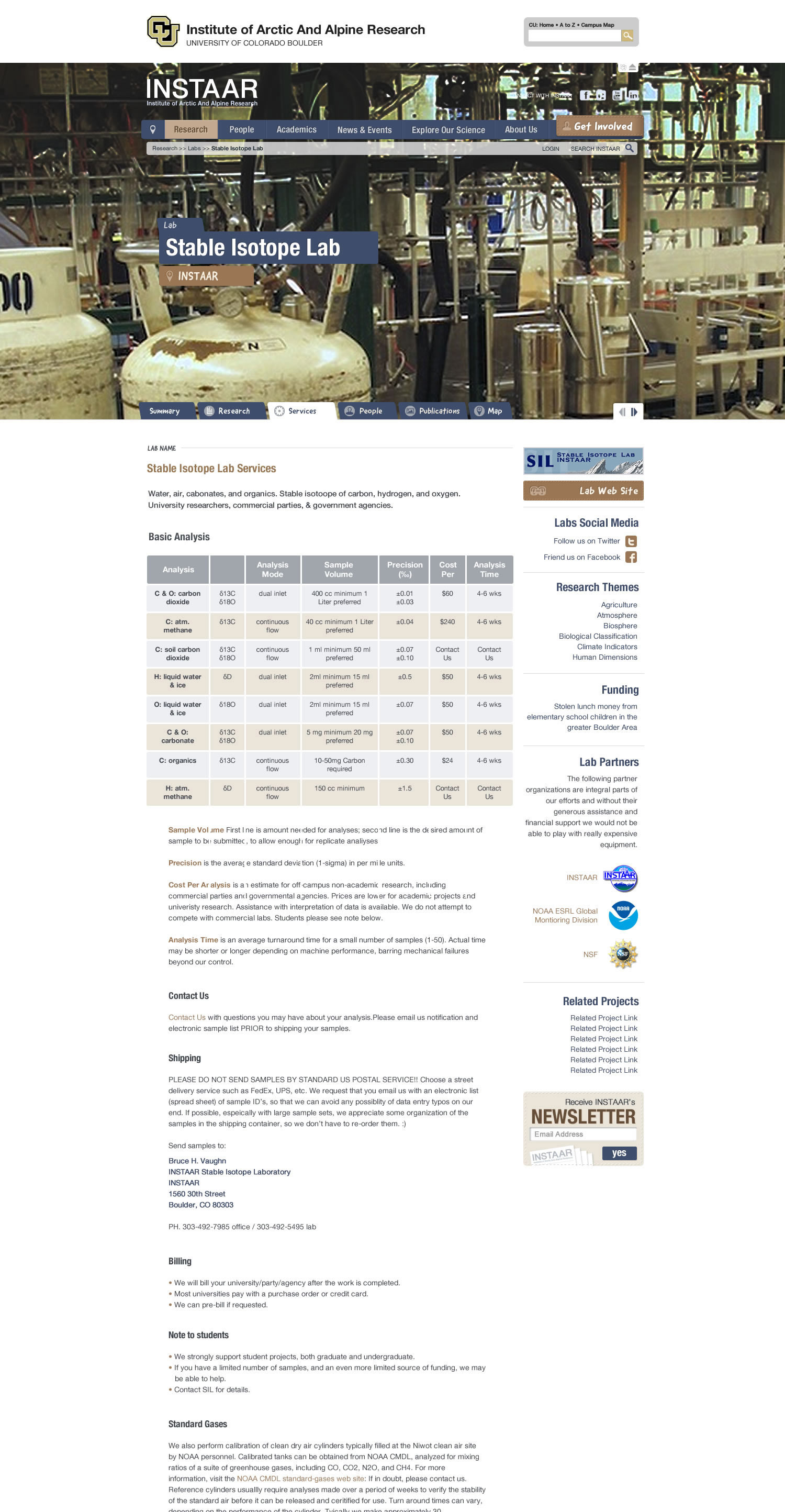
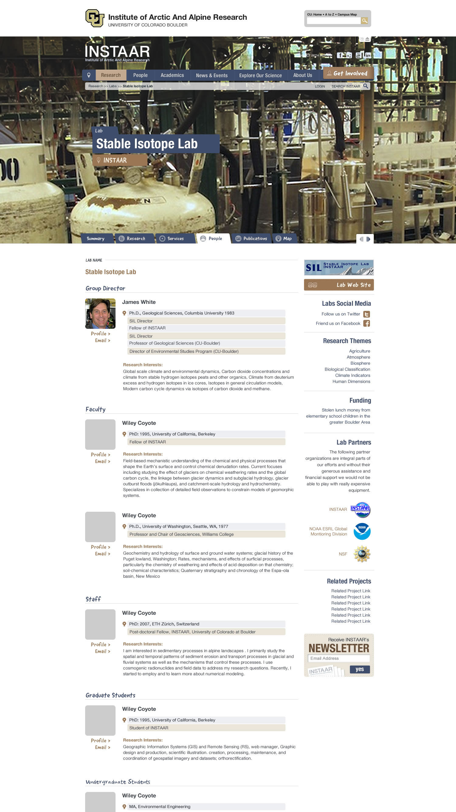
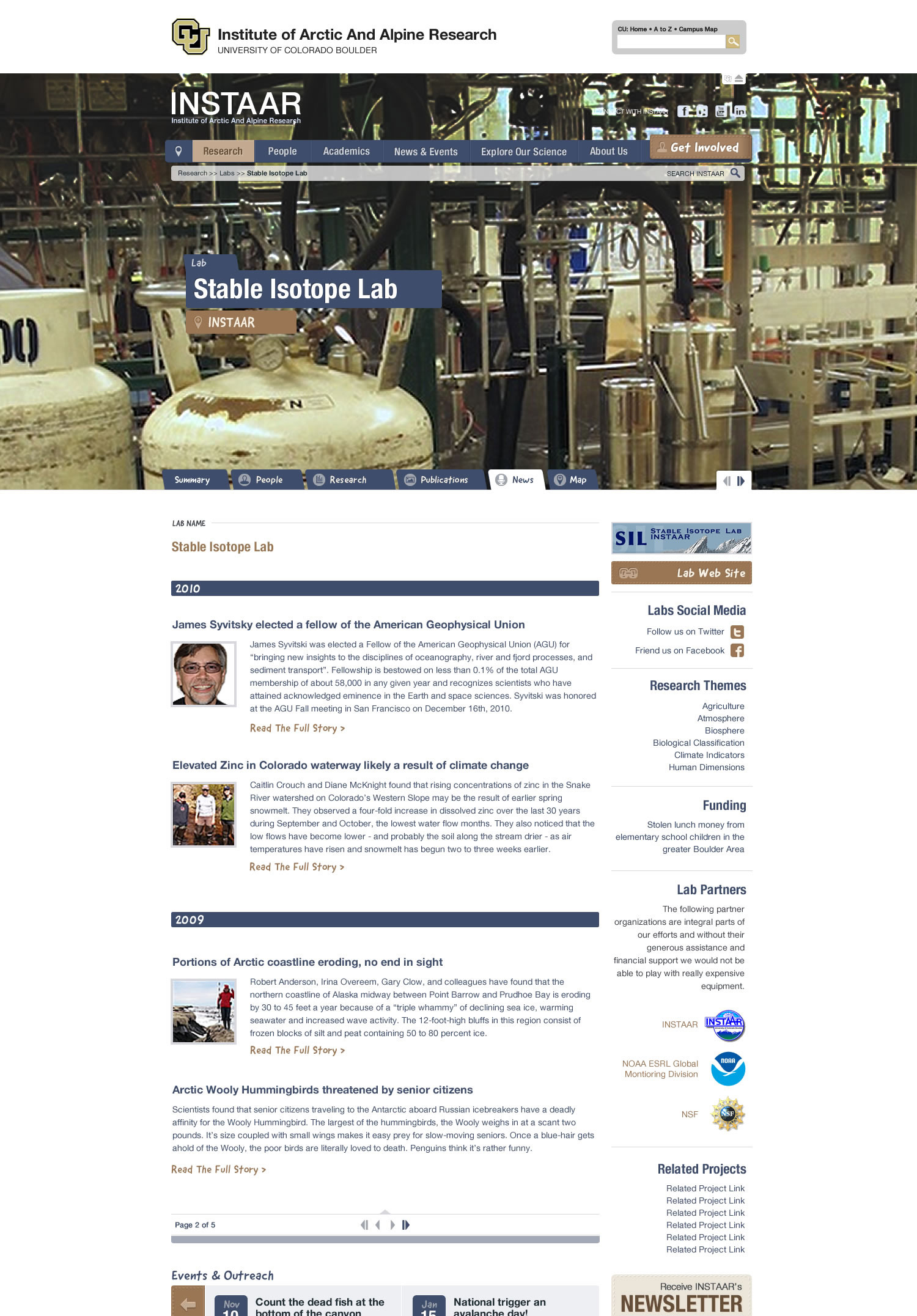
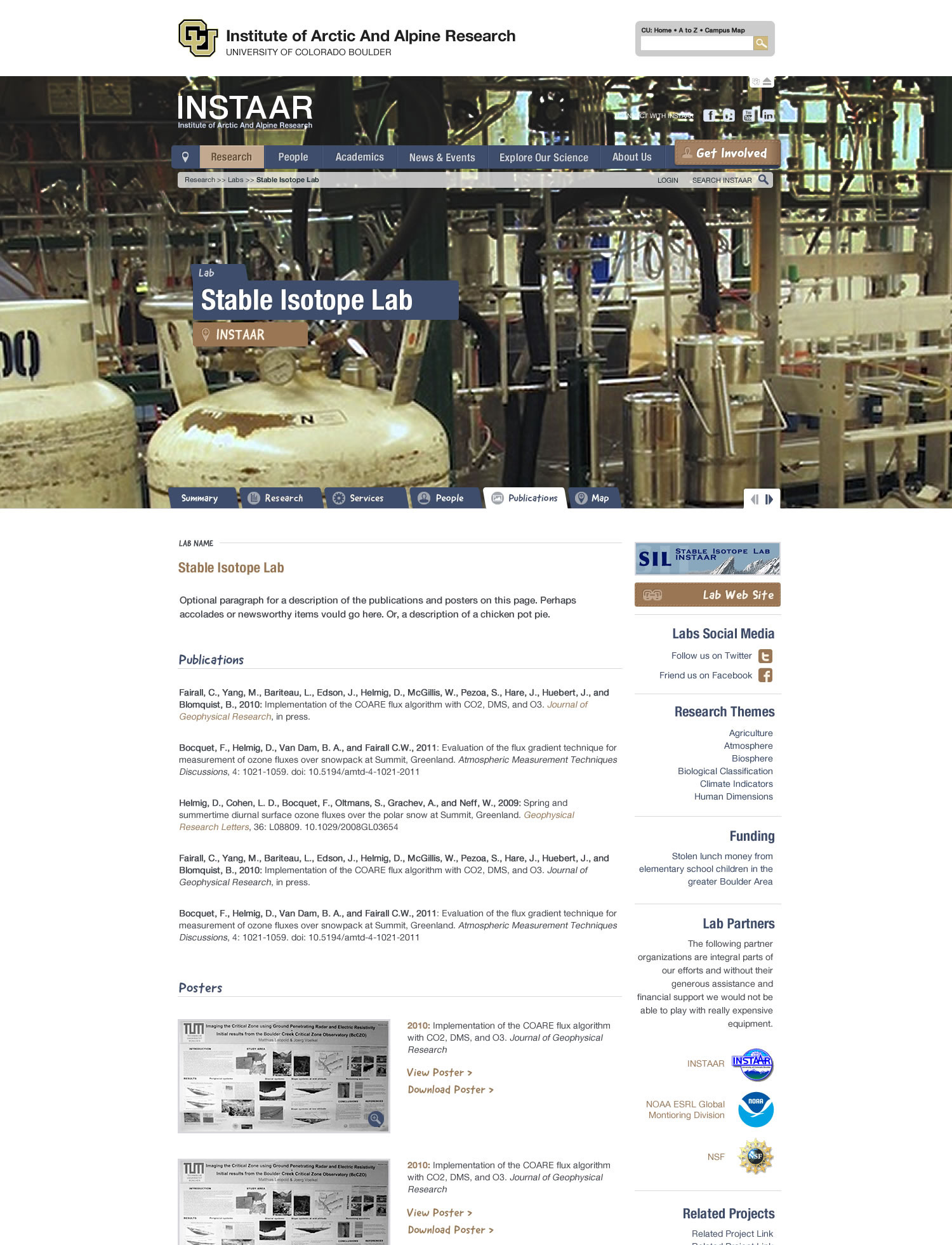
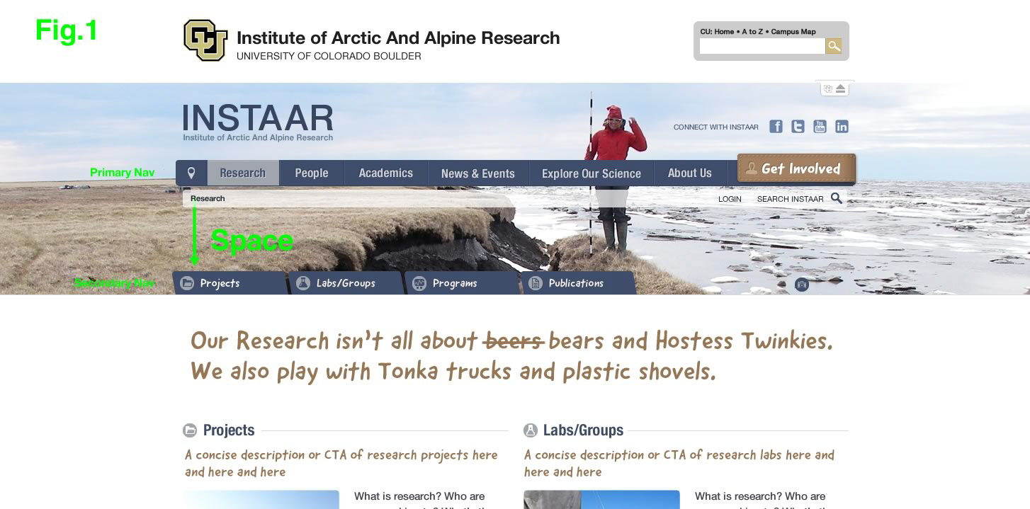
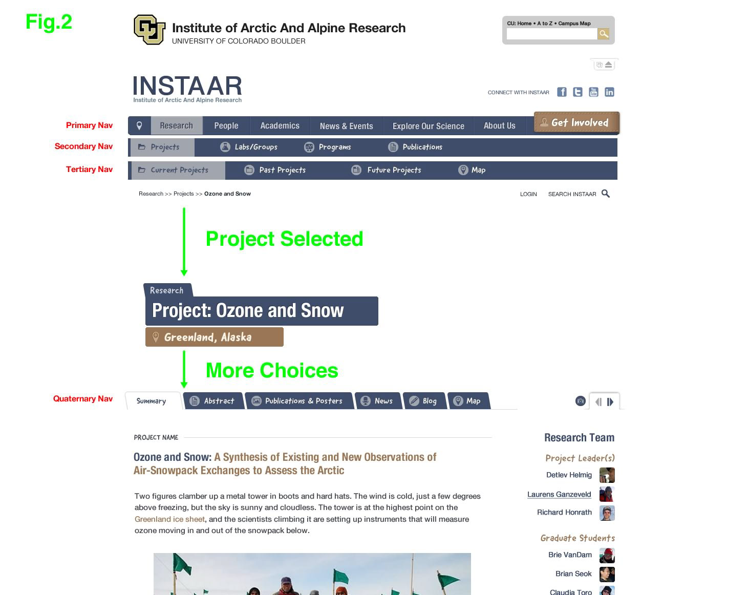
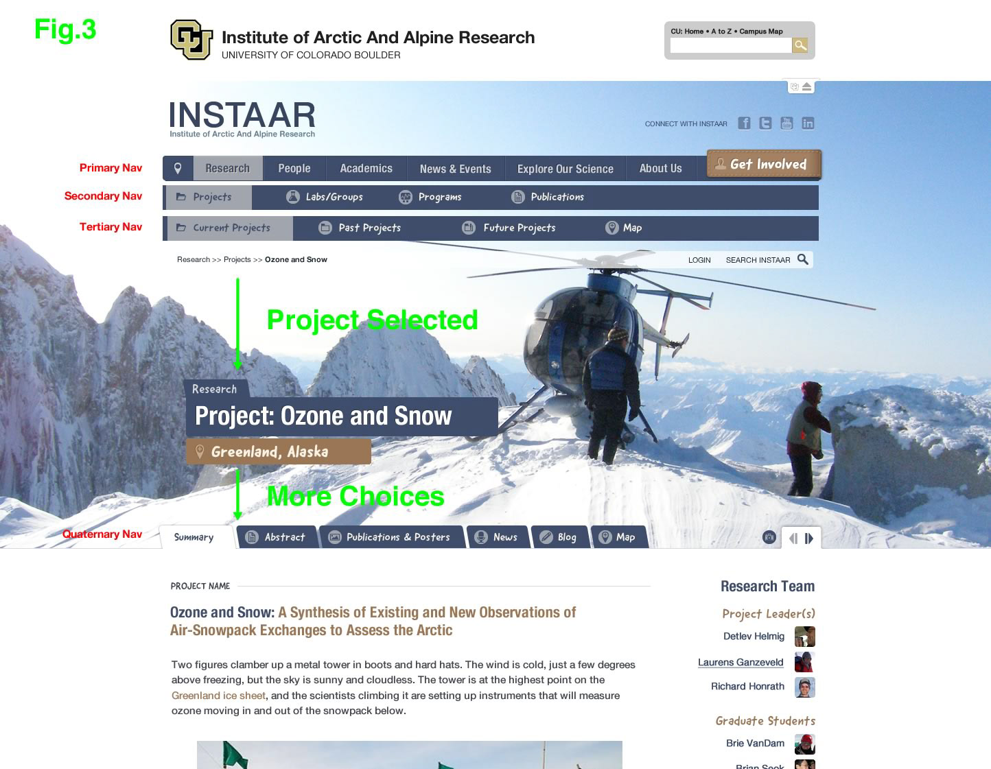
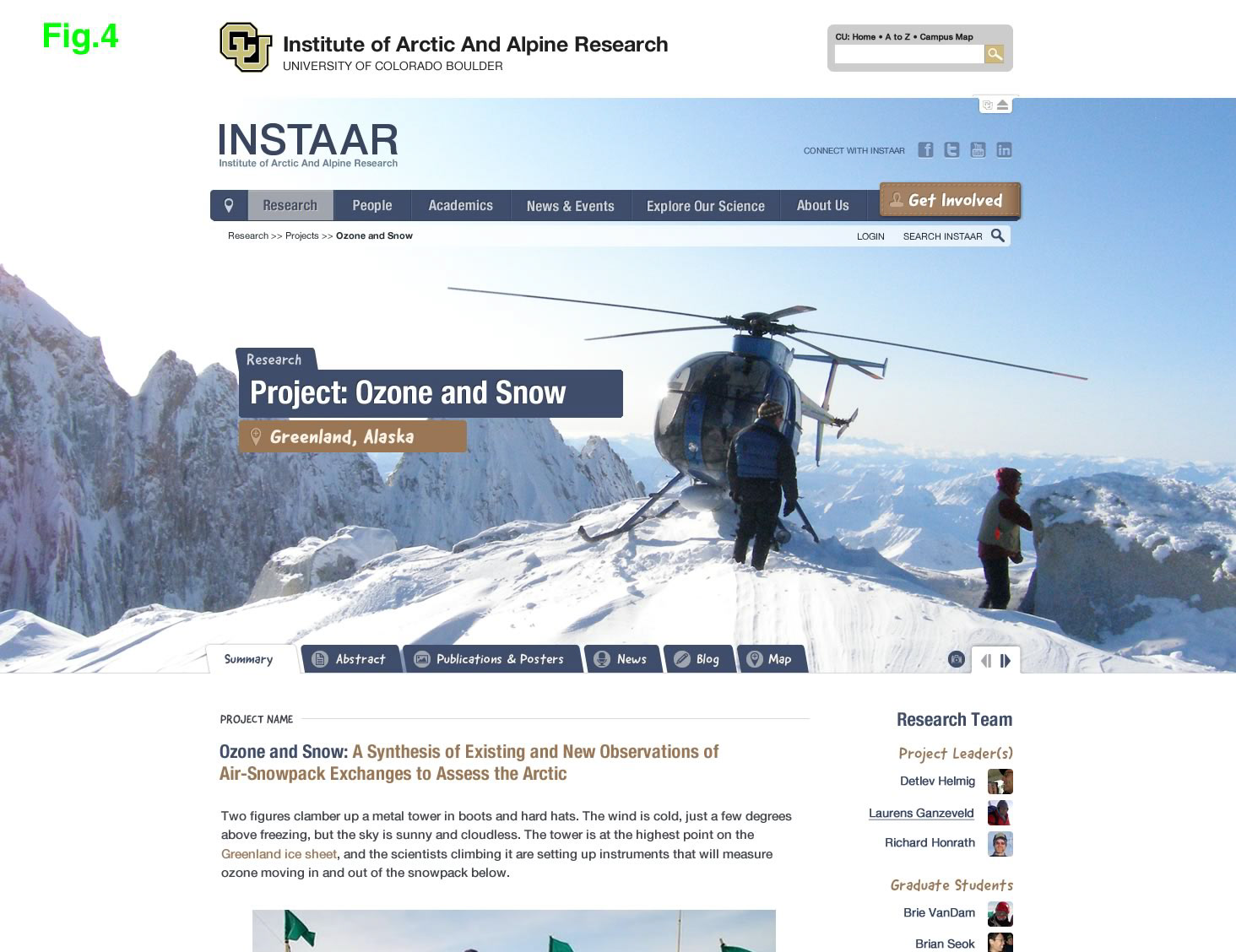
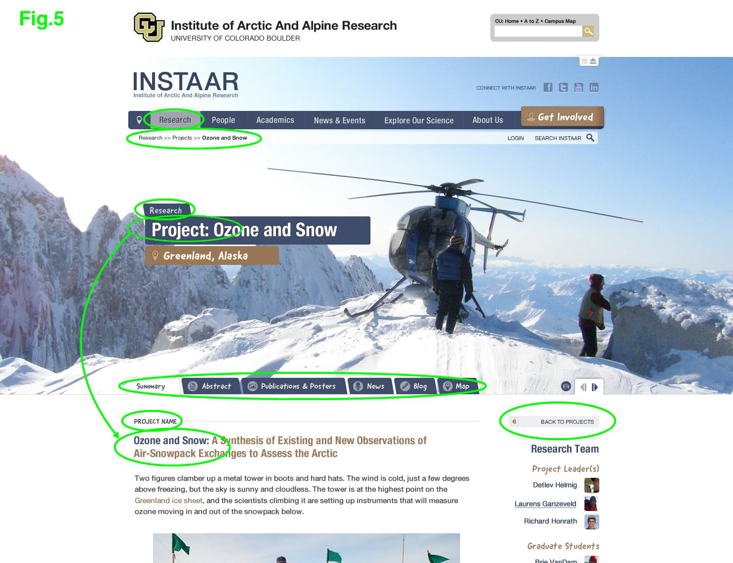
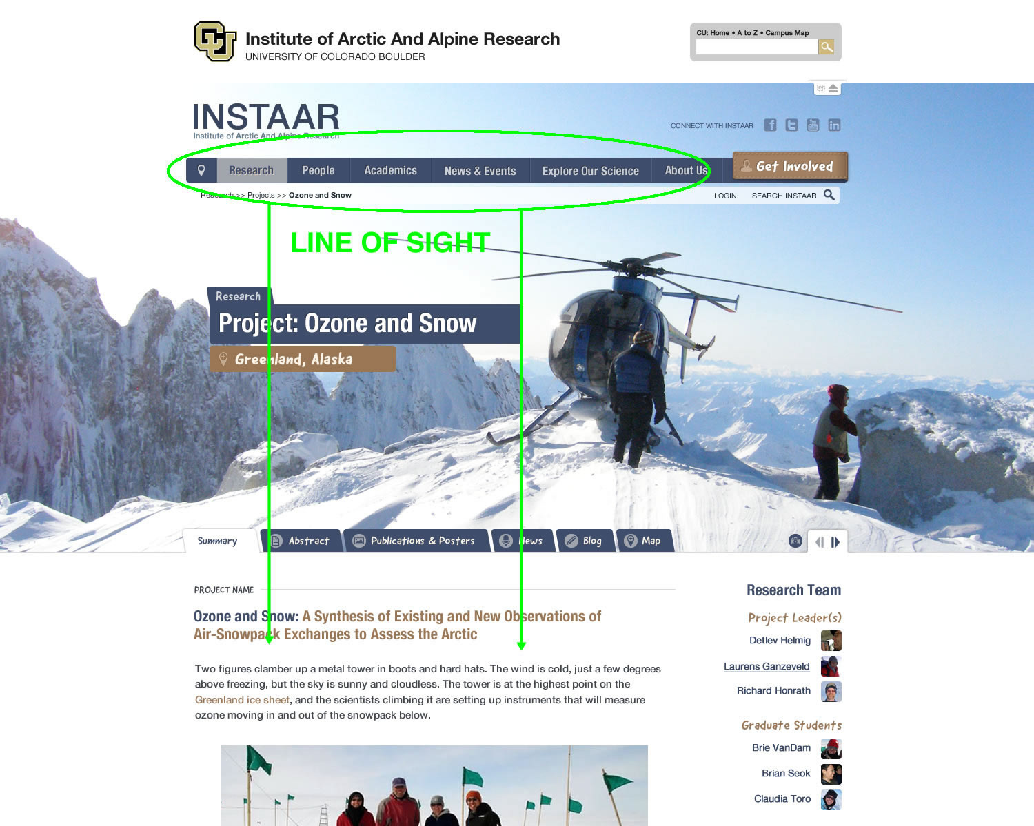
The goal was to design a simple means of accessing content/data that was up to seven layers deep. No simple task. I eventually landed on a simple tabbed navigational scheme that mimicked file folders that I saw laying on desks everywhere in the research facility. This tied in the research aspect of the institute with a simple visual queue. From there, it was a matter of working through how to present multiple layers of sub navigation on a section-by-section basis. A standard navigation wouldn't work, so I devised a method by which the secondary, tertiary, and quaternary navigations would swap out based on how deep users were in a given section. Yet, with the help of crumb trails, back buttons, and text links, users could navigate backwards and forwards without ever losing track of where they were.
We made adjustments to the navigation and content layout based on feedback we received from the board and random users—it was super helpful to work with an organization with limitless access to people willing to test our proposed solutions.
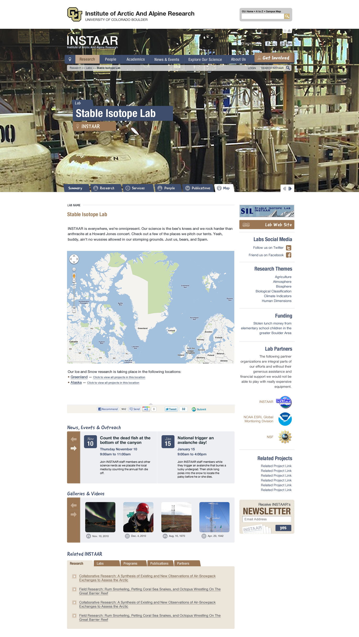
Wireframes & Content Design
The original INSTAAR website had been in service for over a decade and needed to be euthanized and rebuilt from the ground up.
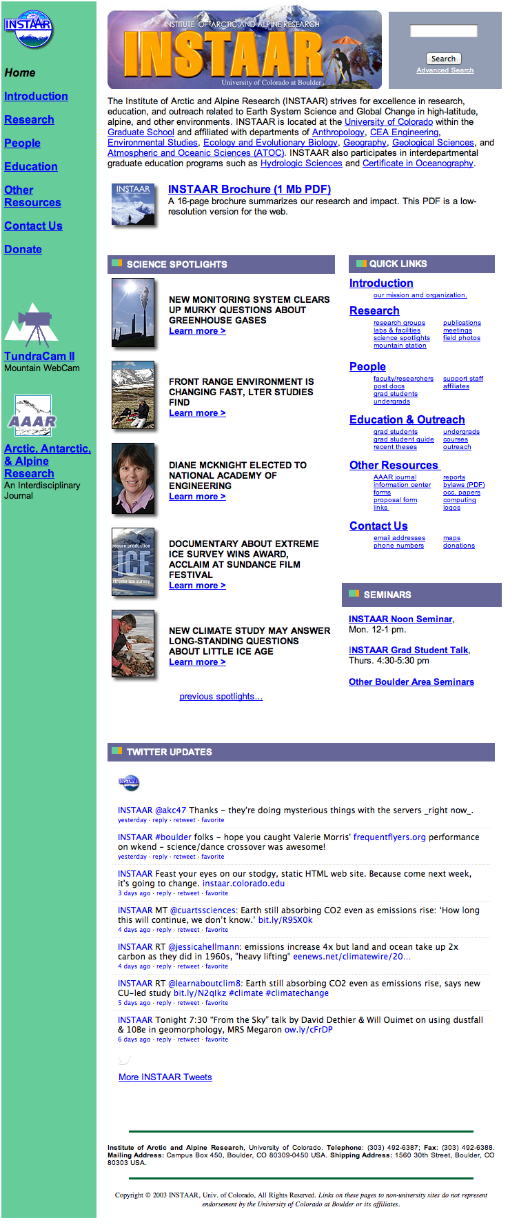
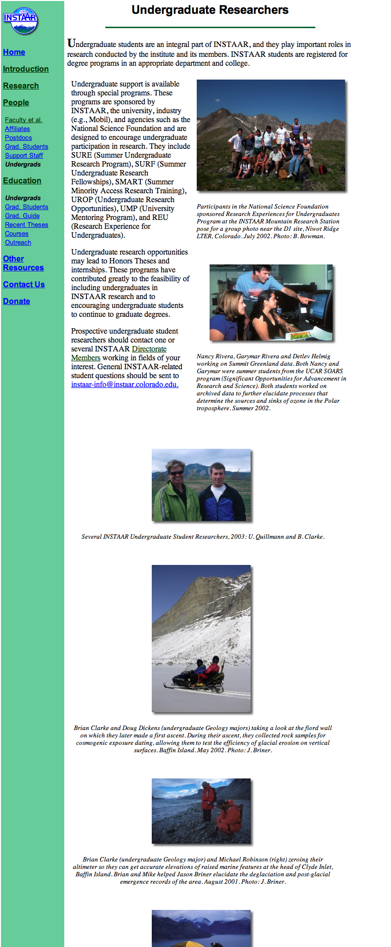
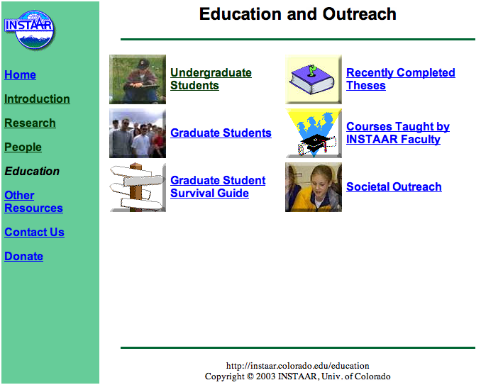
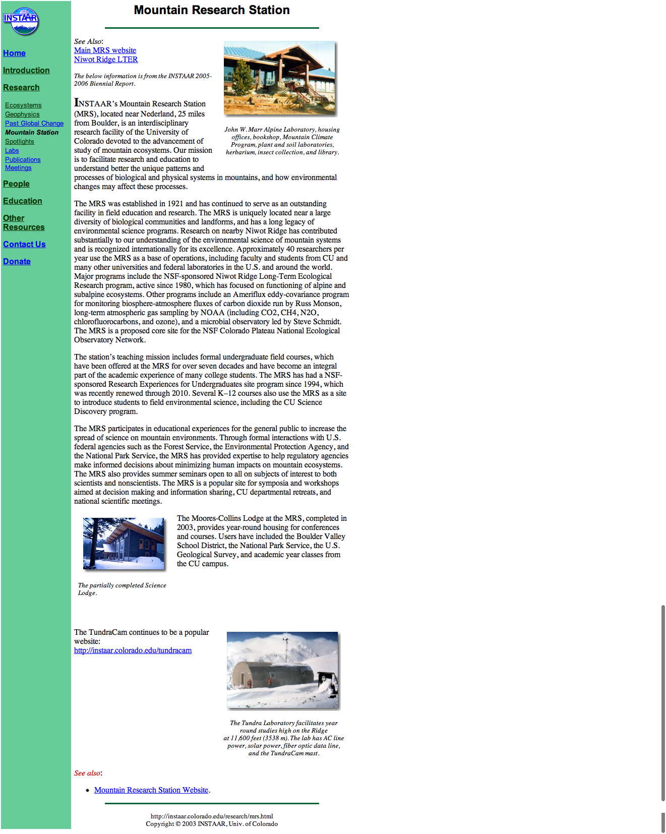
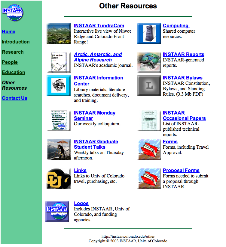

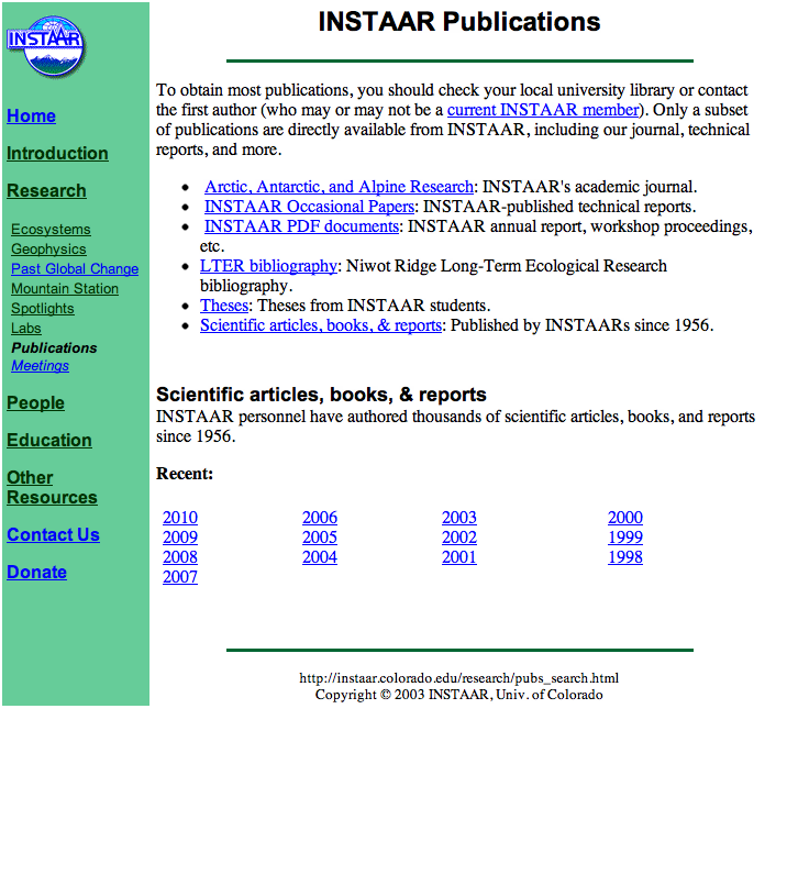
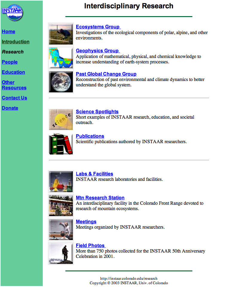

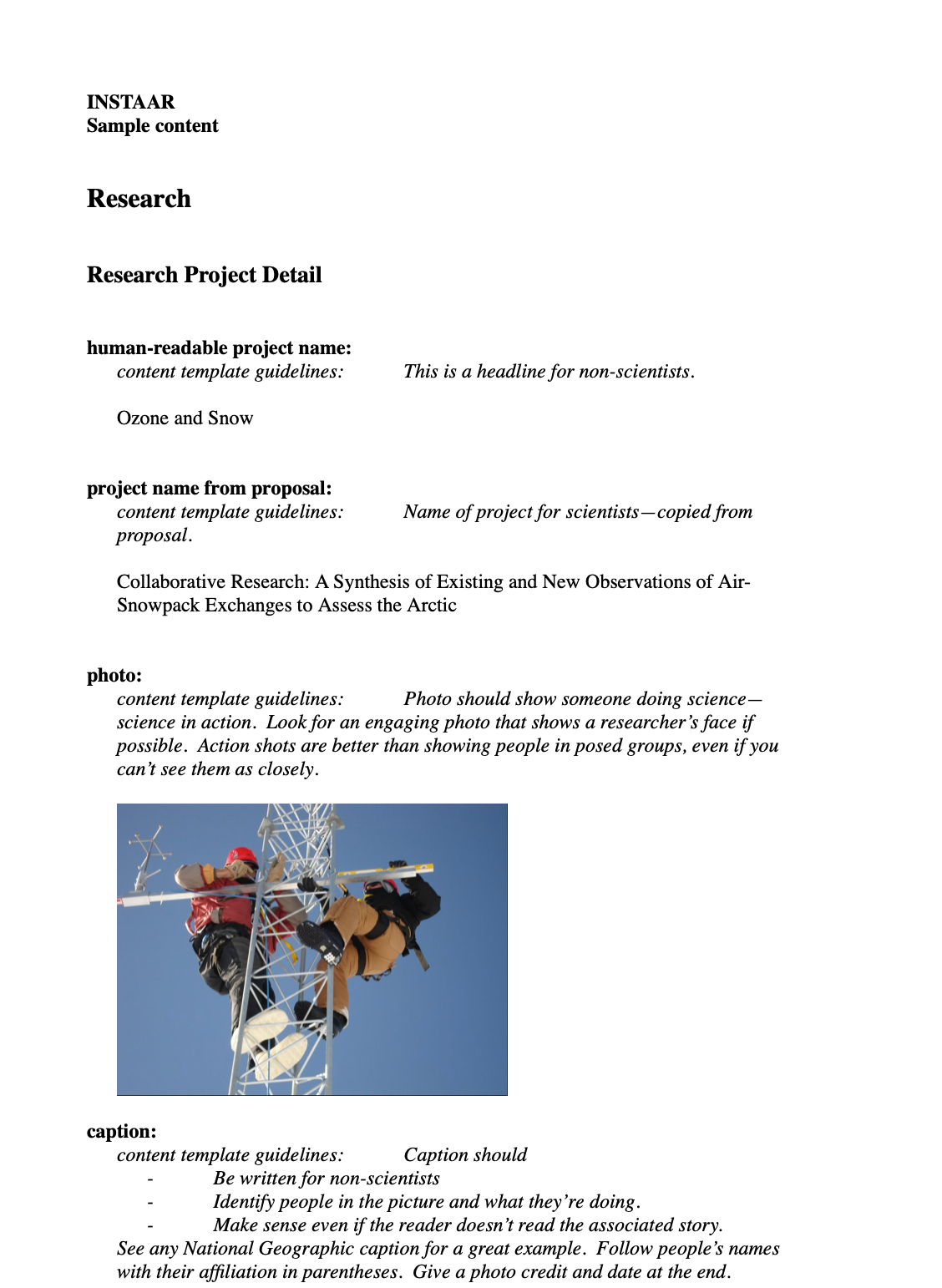
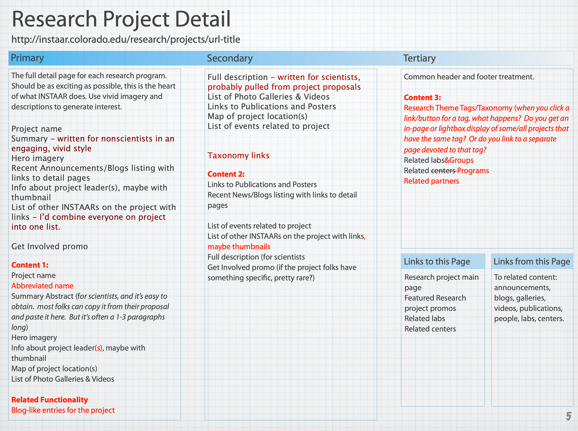
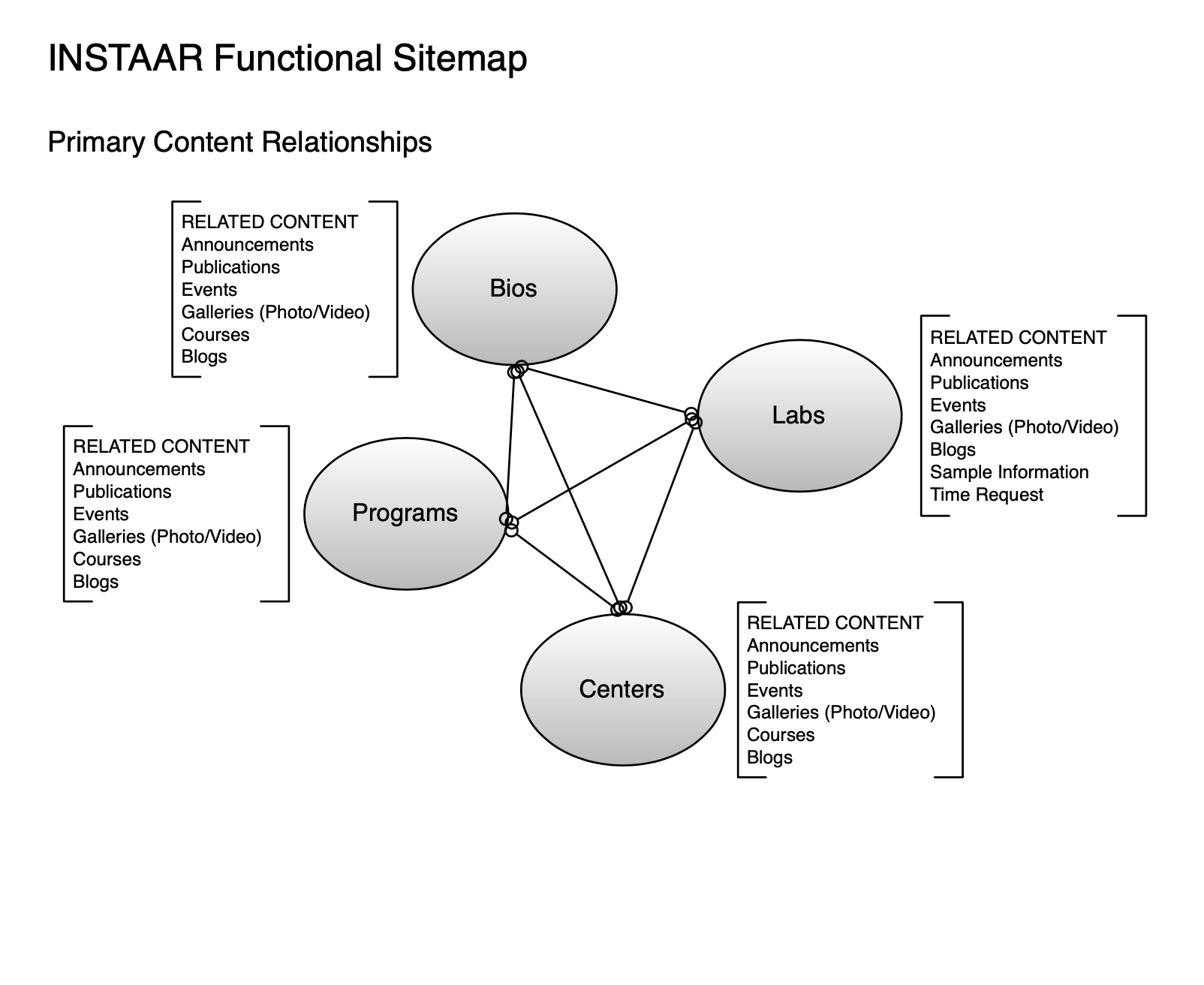
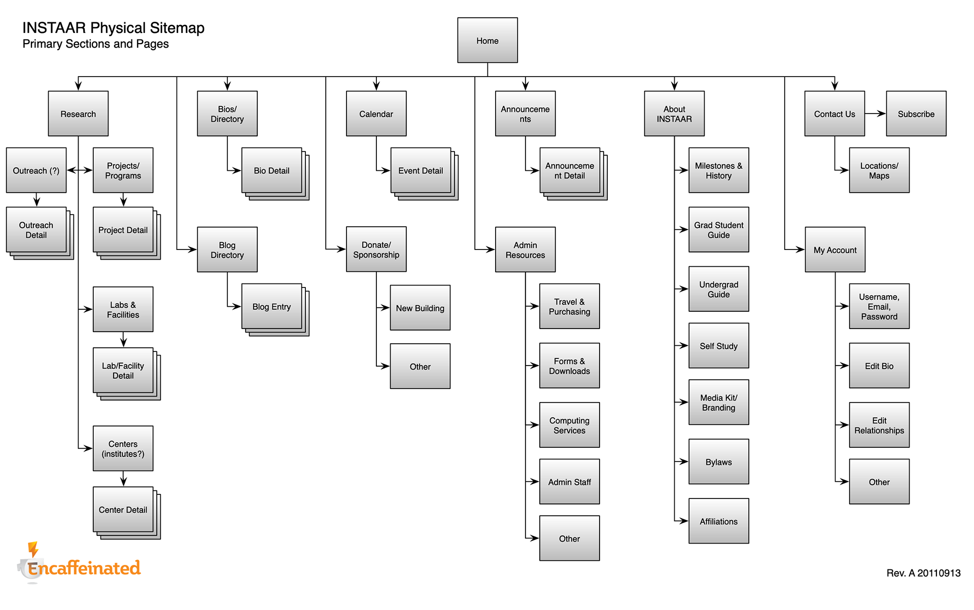
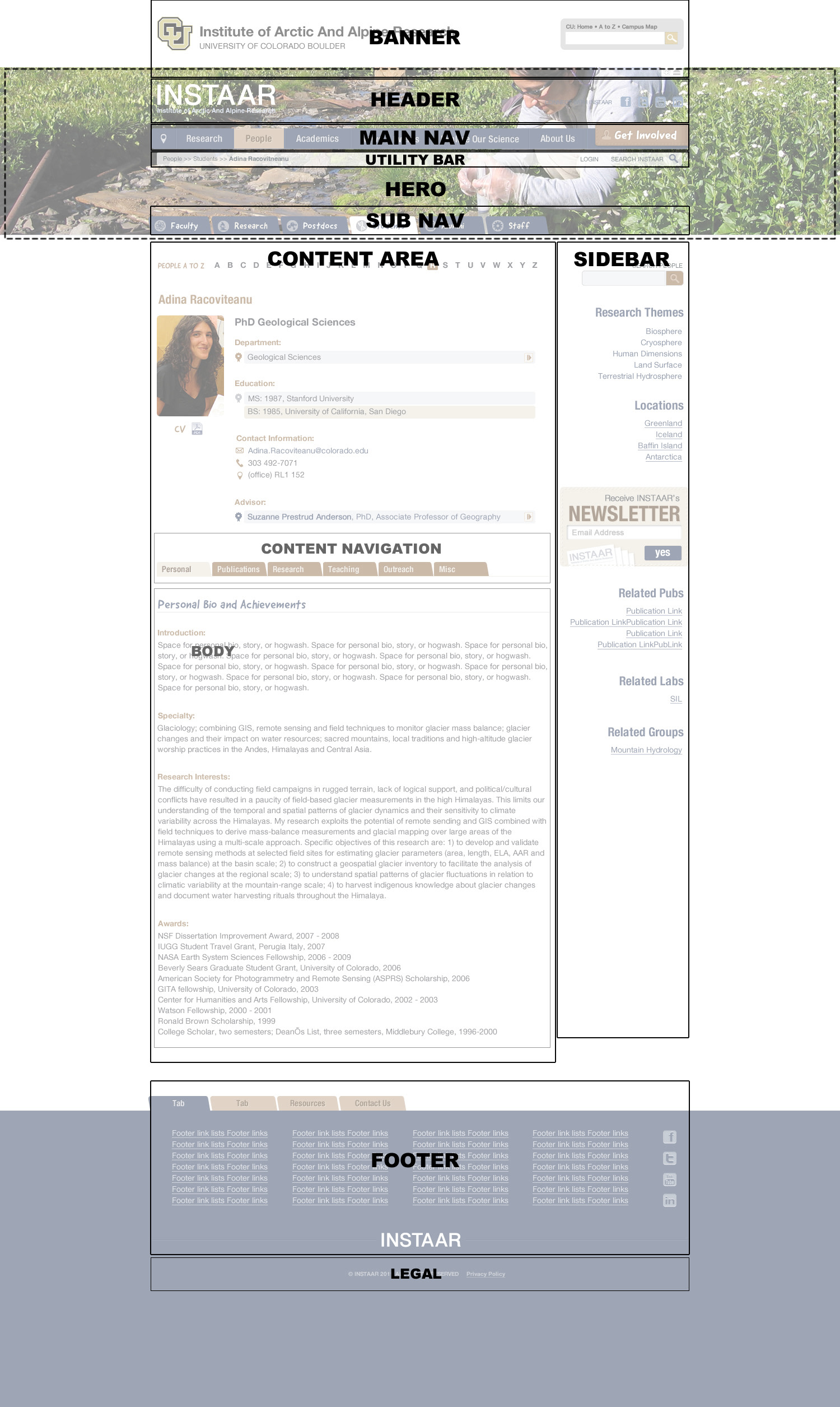
Along with the help of the board, we had put together an exhaustive set of content docs, a physical site map, a functional and navigational site map, and technical map which I used extensively to help me develop wireframes and the final design.
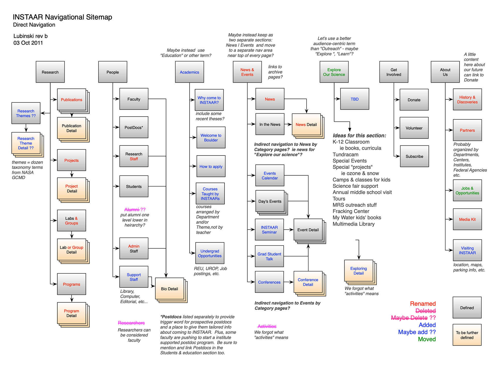

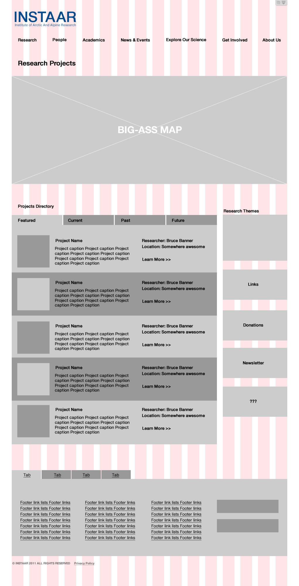
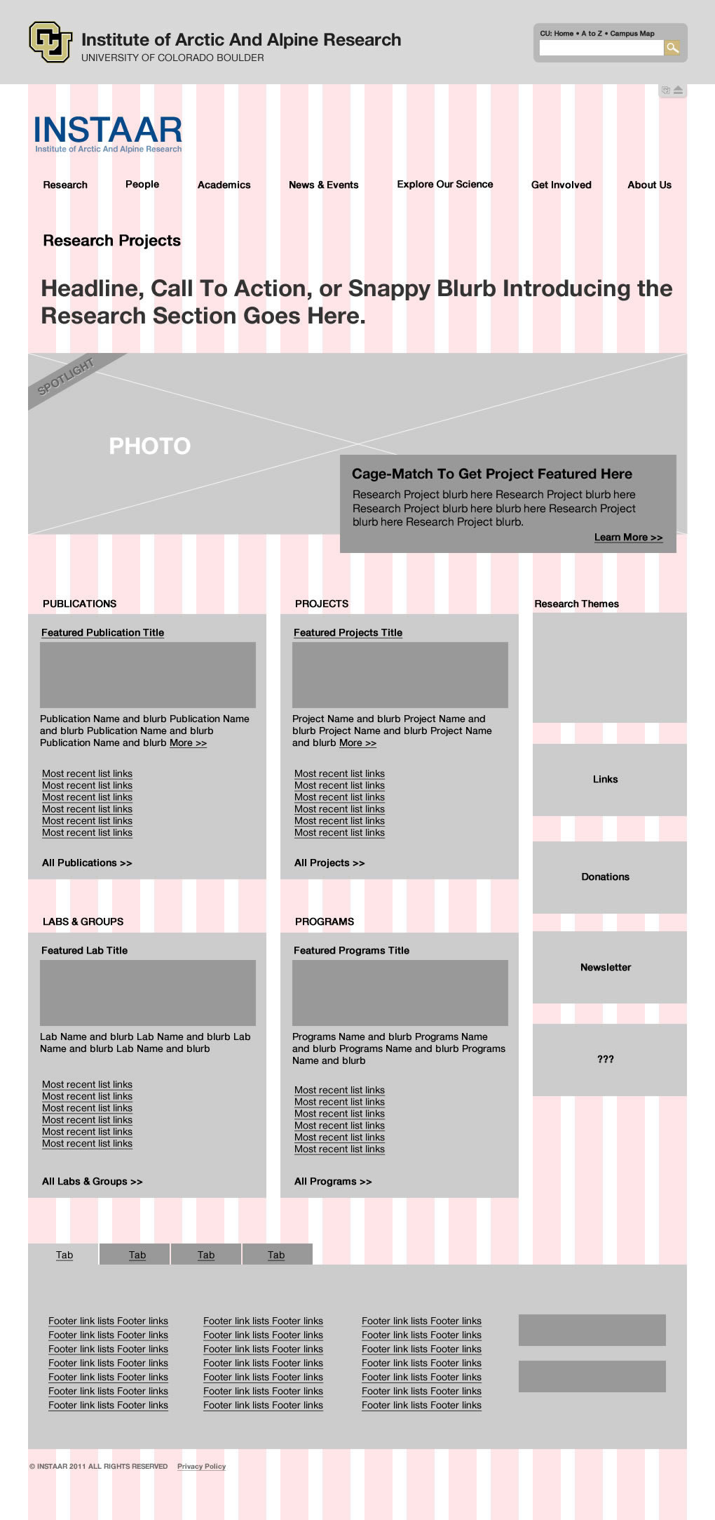
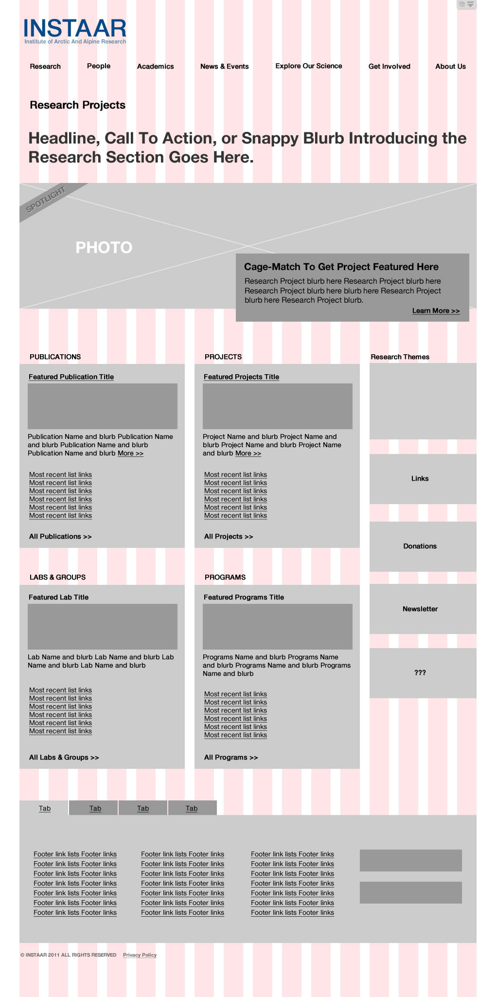


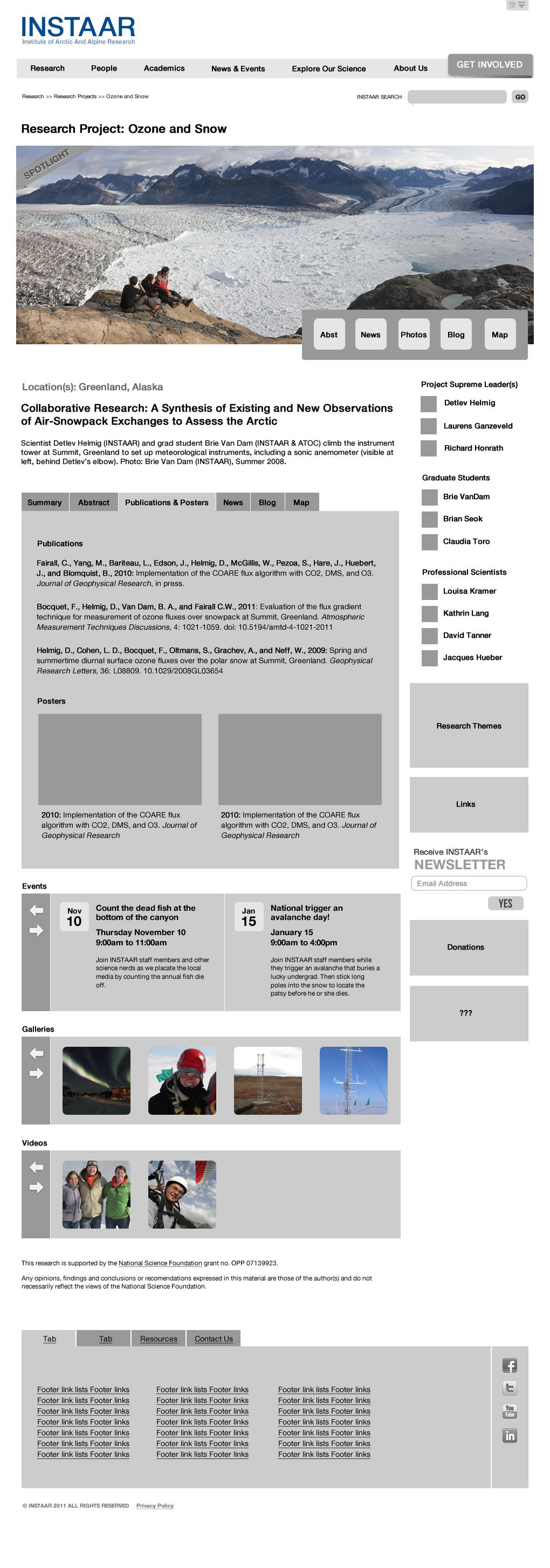
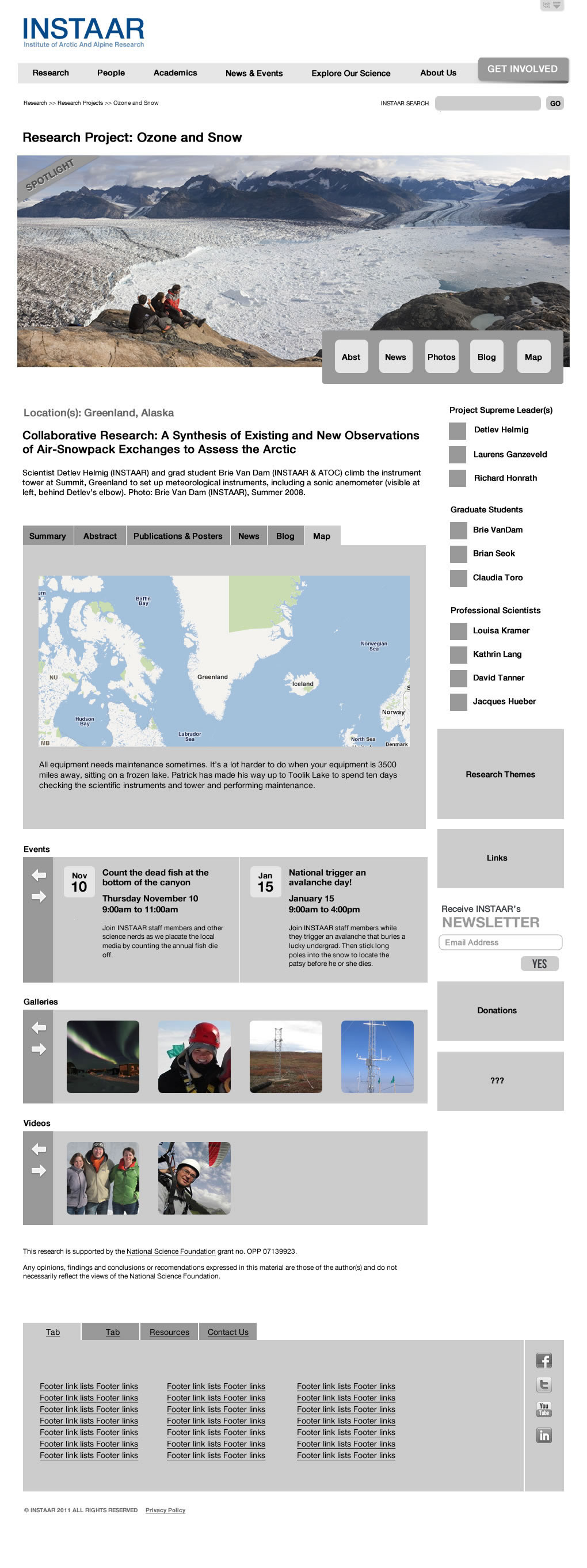
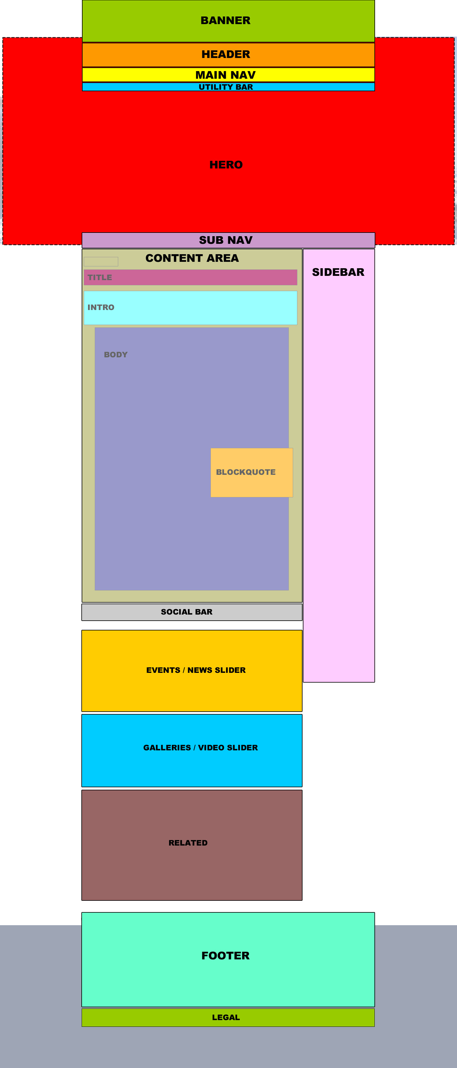
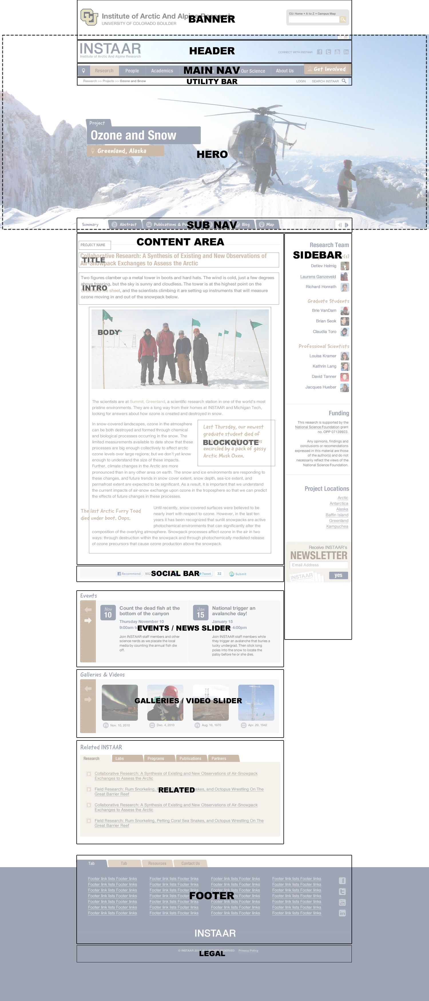
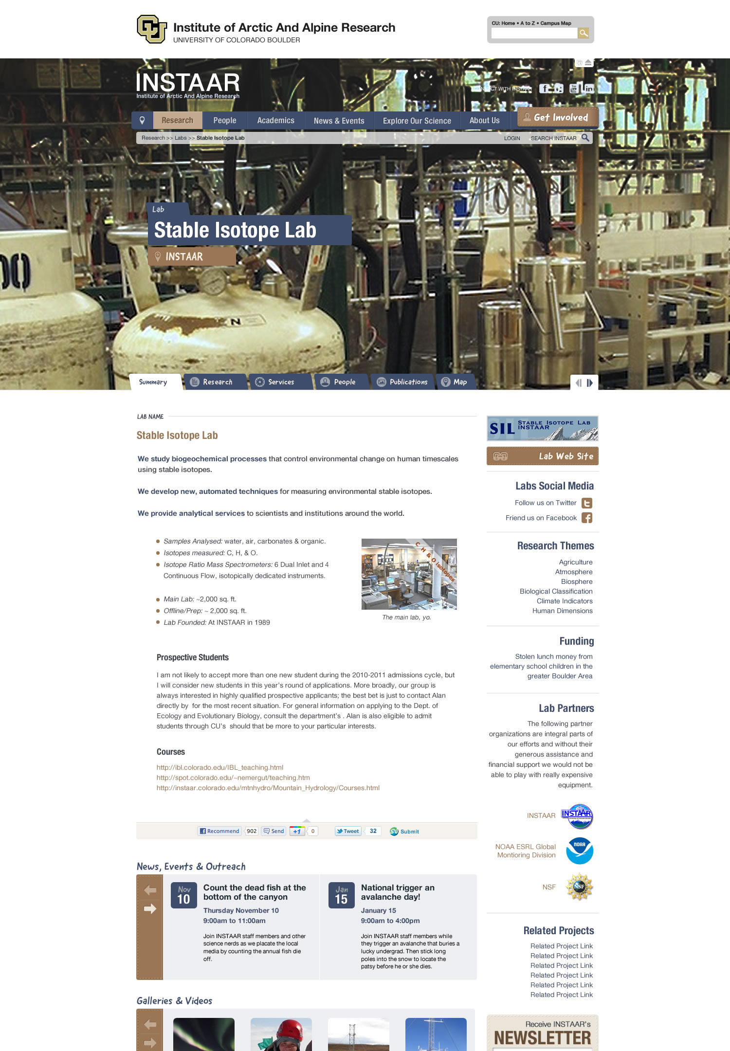
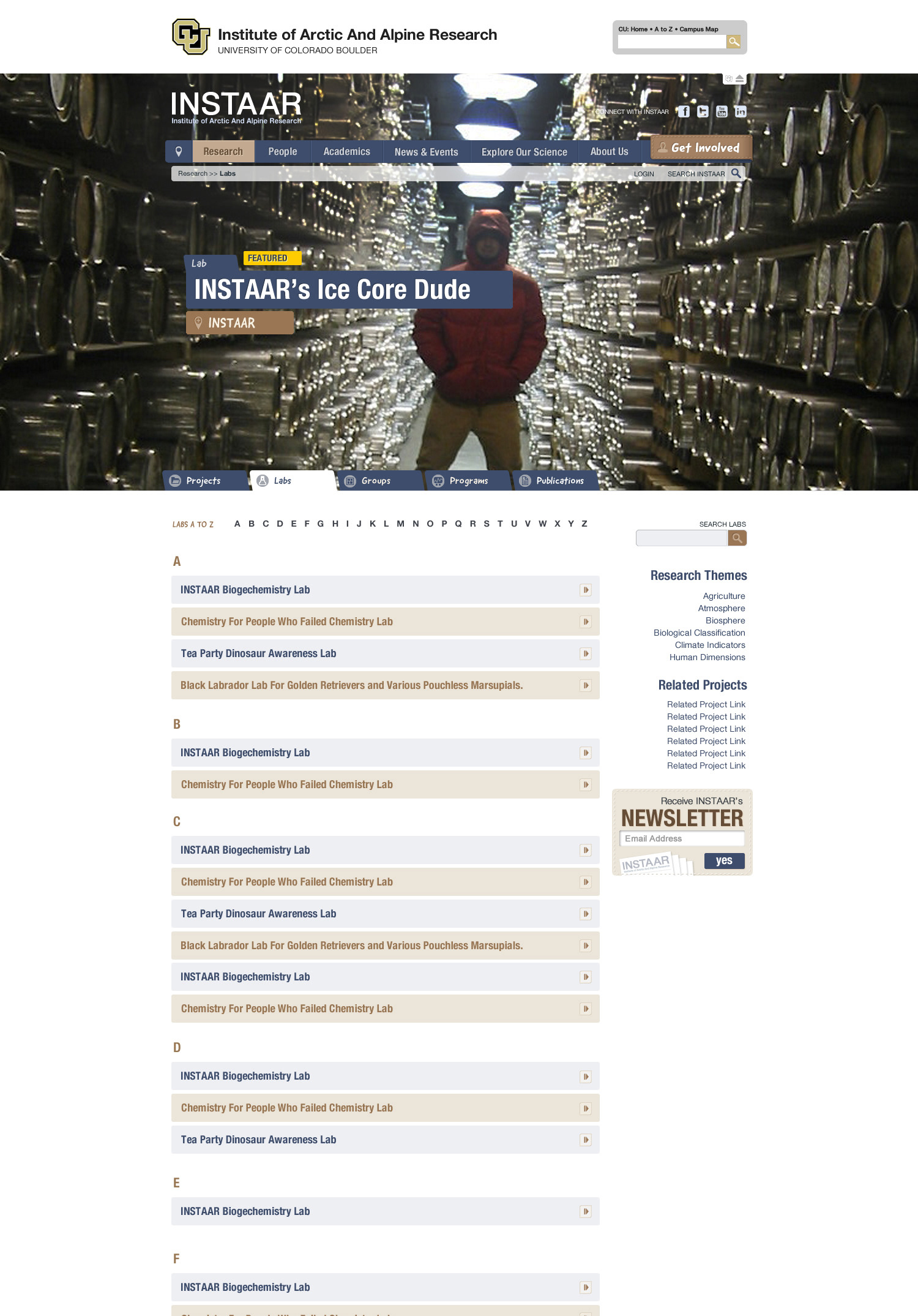
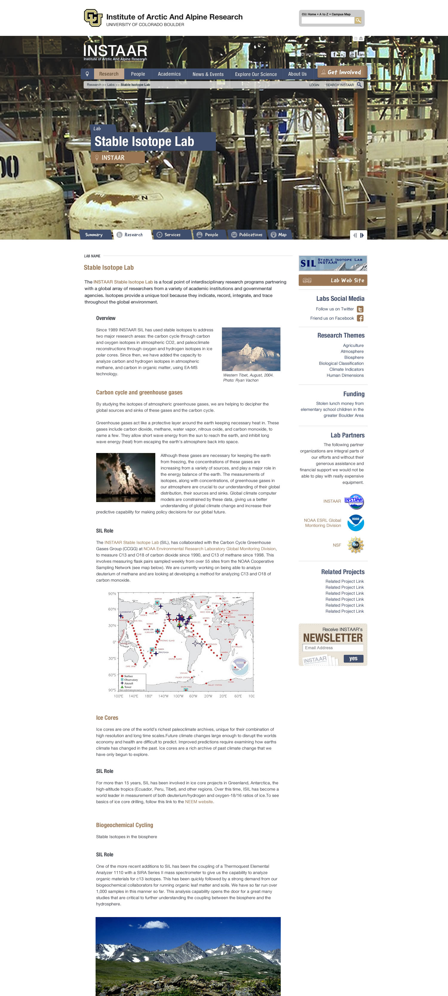
The following sequence of comps is meant to show how users identify where they are as they dive deep into the navigation. Note how information is repeated in the design to help users identify their place.
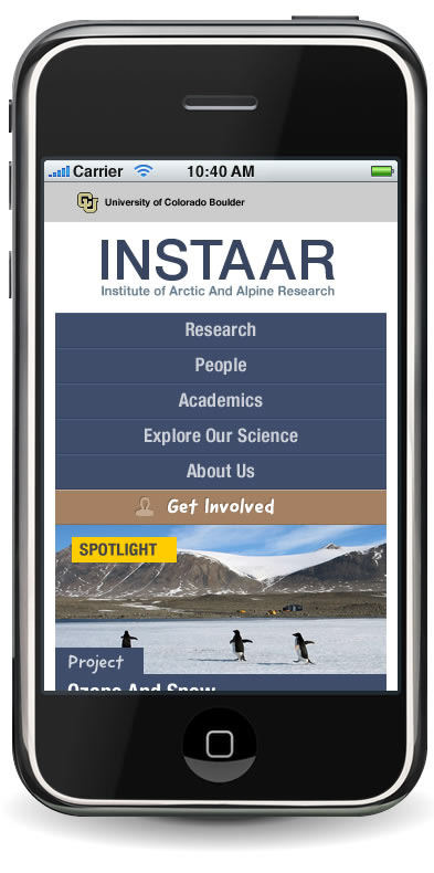
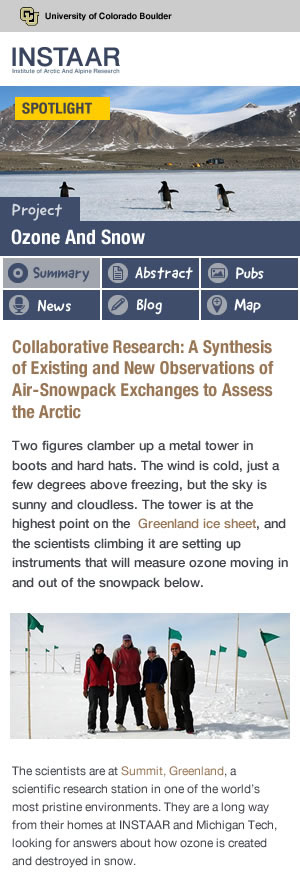
Small Screen Design

Branding: When the "new" logo isn't up to the job
The biggest battle we (I, as the designer) fought with regard to the look and feel of the new website was convincing the board to discard a "new" logo that had been created to replace their old chunky yellow text logo. INSTAAR's field of operations had grown well past its work in the arctic and they wanted to portray this by including a globe in their logo. I disagreed because I felt that there was no visual icon that would accurately capture the scope of their activities on a global scale. The new logo was woefully amateurish—incorporating a clip art globe along with two logos and mountains (to represent "alpine") along with multiple fonts. To be blunt, it was godawful and it would have had a detrimental impact on the professional look of the site redesign. My thoughts and arguments eventually convinced everyone on the board to go with a simplified, elegant text solution.
I improved the original logo by updating the font to a more modern sans serif typeface that would be highly readable and simplified it by including the full name of the institute below the acronym ... and removed the CU logo entirely. The CU logo was mandatory, it had to be part of the site design. My solution was to include the CU logo in a separate user-toggled banner at the very top of the layout along with a search field for the entire university, thereby maintaining the connection with the University of Colorado Boulder but not trying to shoehorn two logos into a single mark.

Original INSTAAR Logo

NEW INSTAAR Logo
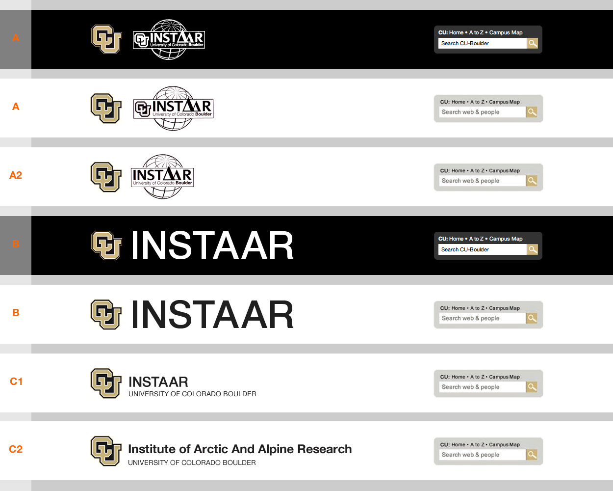
Variations submitted to convince the board to choose my proposed logo solution

New logo on fake brochure
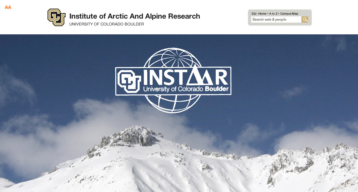
New logo placed on "site" home page image to show how tacky it looked
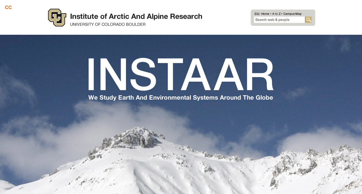
My proposed logo solution placed on "site" home page image to show how clean it could look by simplifying its presentation

Proposed solution on fake brochure
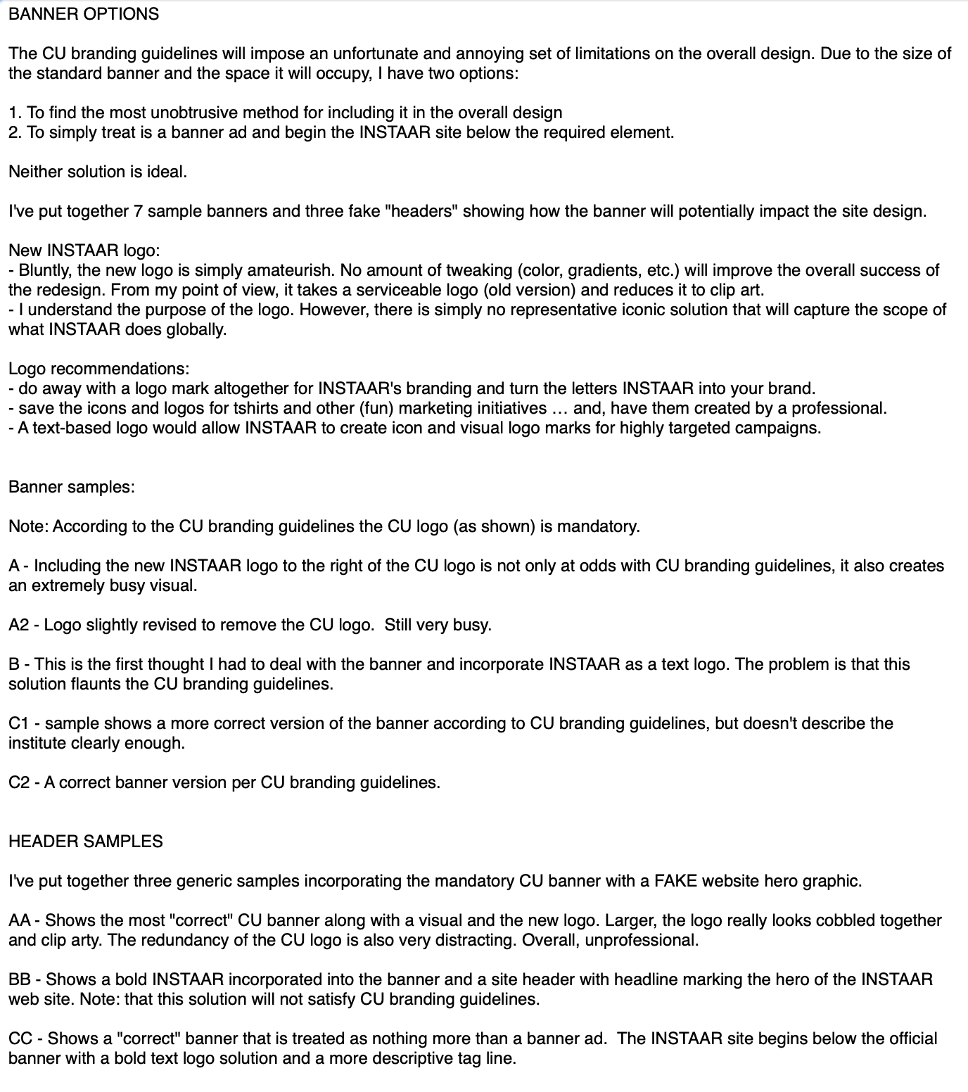
My argument notes for discarding the new logo and using my proposed, simplified logo solution
INSTAAR may be a full-fledged part of the school now (based on the fact they dropped their logo from the current site design), however, at the time, it was a quasi-independent research organization.
Getting personable
I did a fair amount of copywriting during the design development, which is to say I wrote some silly nonsense to provide an examples for the board to understand how personable, relatable language could help engage people who were not scientists and maybe convince them to support the organization as a volunteer or with donations. Turned out that the board found a lot of what I wrote hilarious and while most of my word wrangling was scrapped, a few nuggets found their way into the final site design (Hint: All of the donate and subscribe page text).
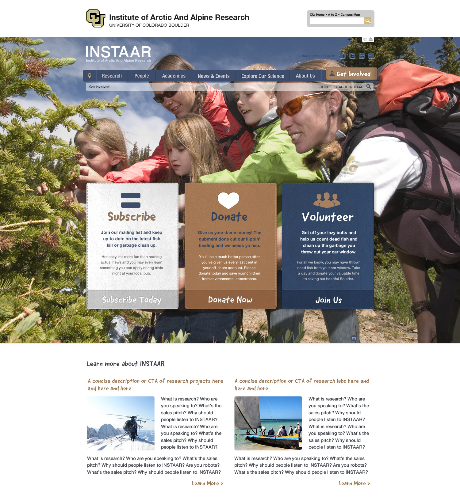
Get Involved Lander
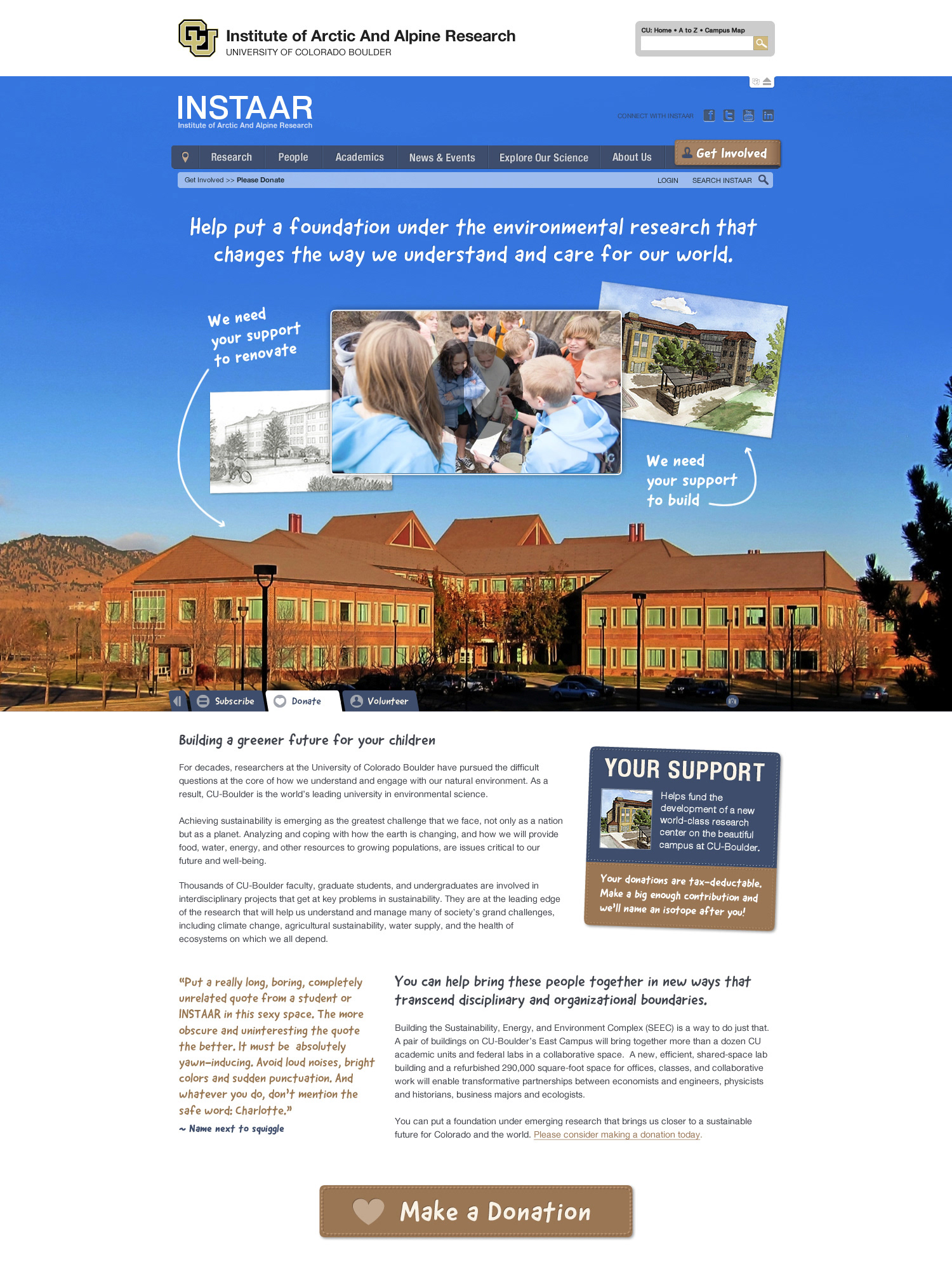
Donate page
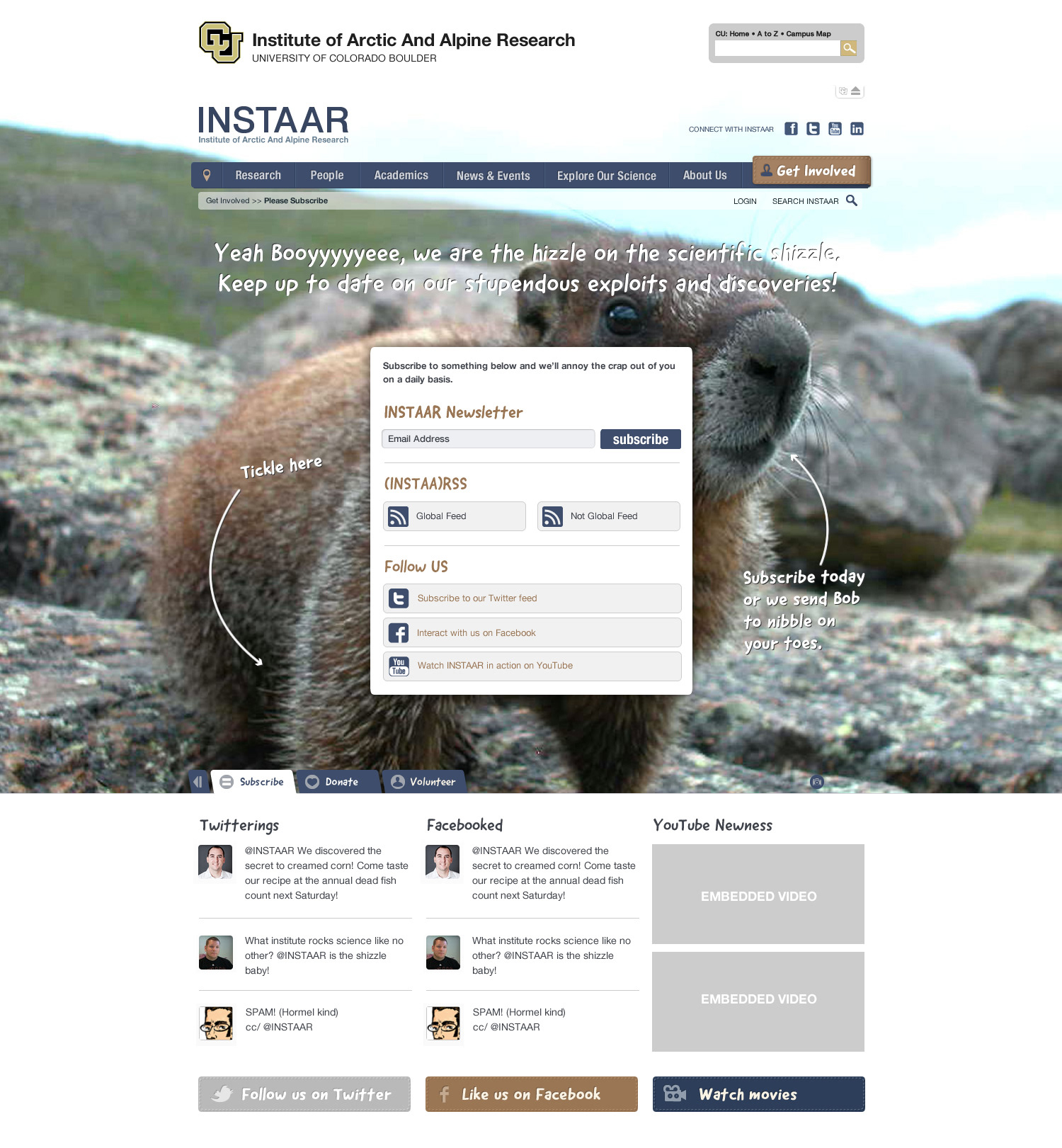
Subscribe Page
While touring INSTAAR's facility, I found this sign on a lab door and incorporated it on the 404 page—Scientists have a delightful sense of nerd humor and I wanted to make sure that humor permeated the site.
I'm still honored to have been part of an amazing team that was selected to work on this incredible project for a fantastic organization that does research for issues and interests that are very close to my heart. That's a lot of accolades, but for good reason.