Turning technical security concepts into visual narratives
F5 is an industry-leading web security firm with offices and subsidiaries around the globe. Over six years, I created visual solutions that translated complex technical concepts into clear, compelling imagery — work that helped raise the bar for how the industry communicates.
"In all my years in business, working with hundreds of people, I've never worked with a single individual who has had a bigger impact on a company than you have had out of the gate".
~Preston Hogue, VP, F5 Labs
Context
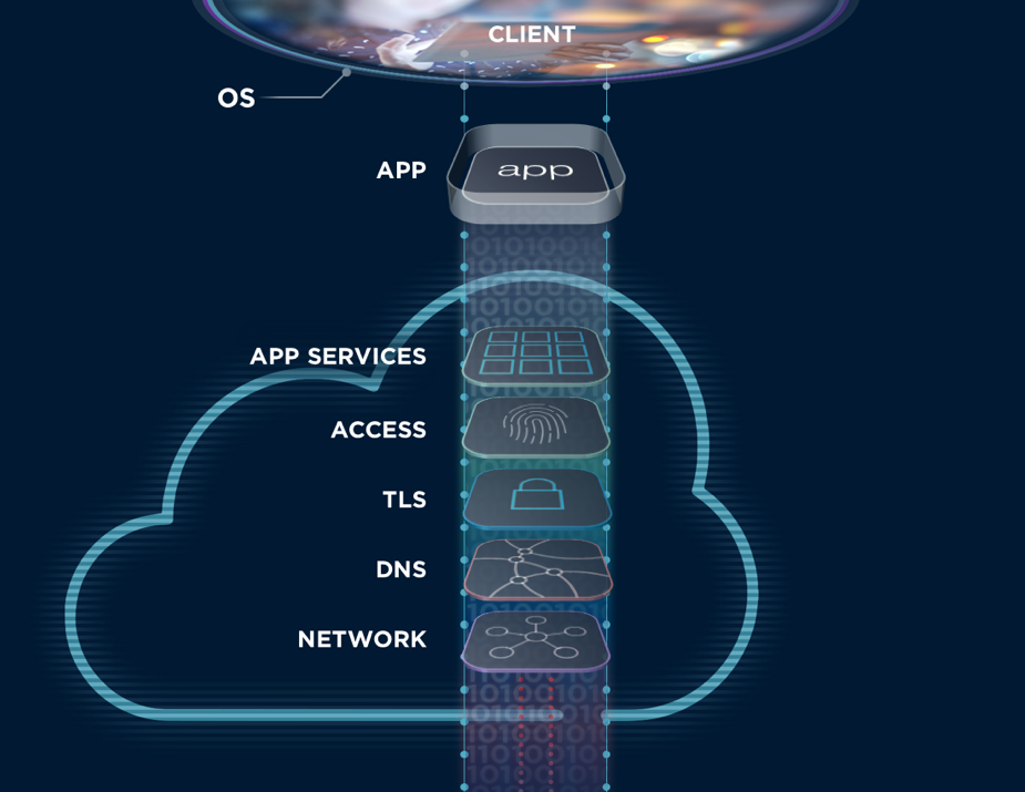
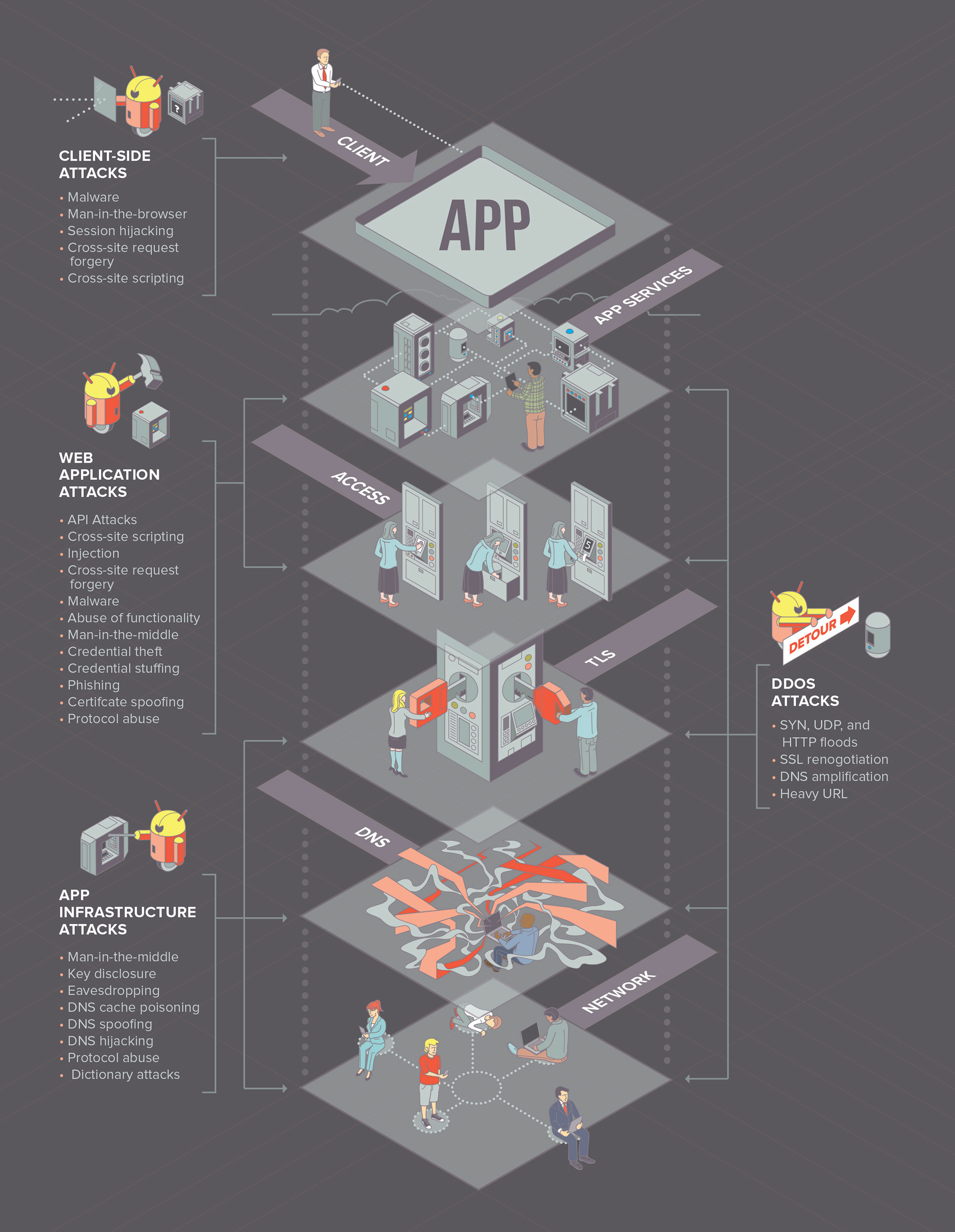
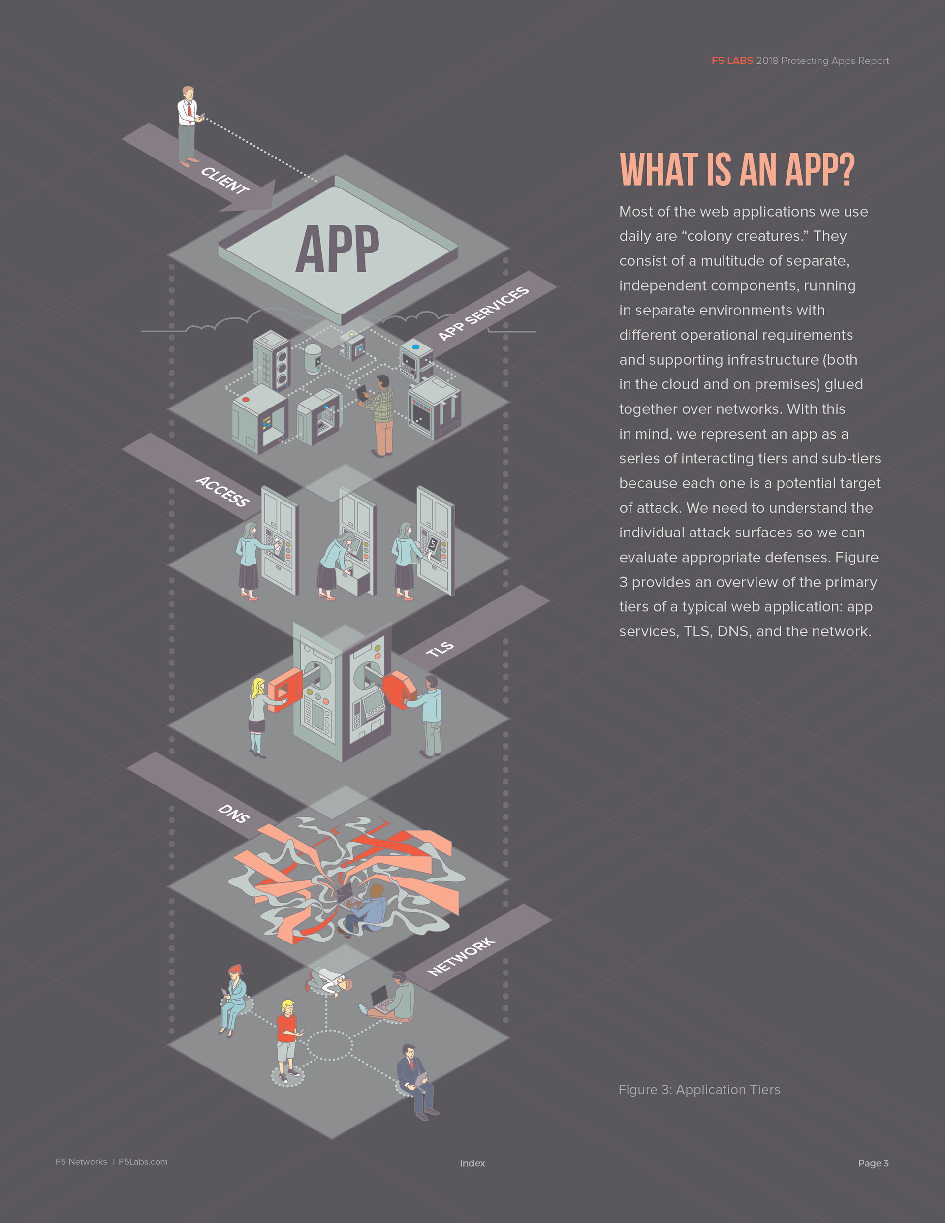
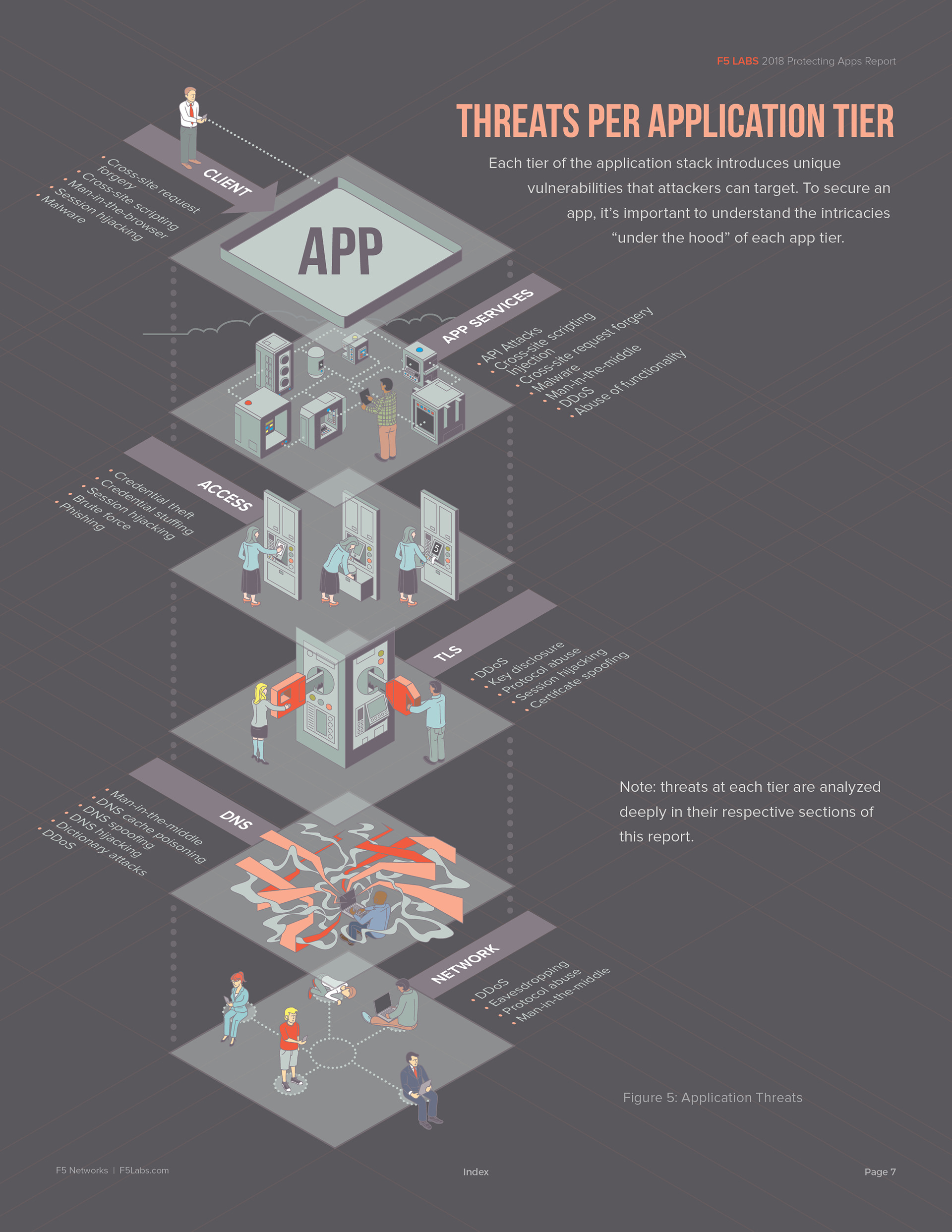
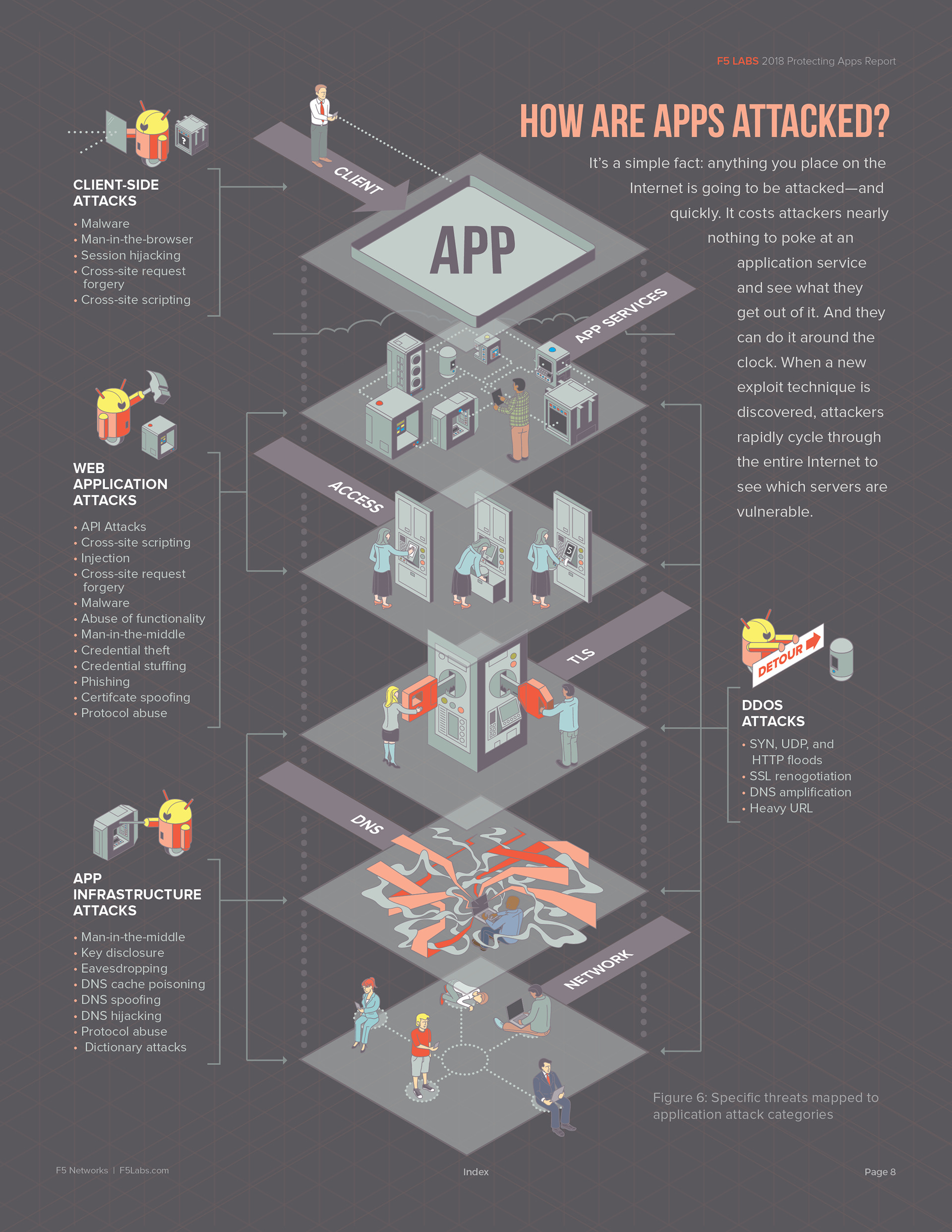
One of the more challenging projects I tackled with F5 Labs was recreating and enhancing a graphic they had used for a decade to describe the various tiers of web security they monitored. This graphic served as the centerpiece for the 2018 Application Protection Report — their premier annual publication, which provides F5 clients with a deep dive into current web security trends and the solutions that keep F5 at the forefront of security research and threat analysis.
I was tasked with updating this graphic and designing the report's introduction. My solution visually describes what each tier represents without the need for textual clarification.
Audience
The audience for this work included clients, industry insiders, fellow employees, and B2B partners. Even so, I approached every F5 Labs project with the intention of creating visual solutions accessible to a general audience, given the global reach of this work.
Collaboration
Research for this project began with several rounds of video calls with the core team of four: Preston, VP of F5 Labs; Sarah, Director of Threat Research and Project Manager; Ray, Senior Writer; and Justin, the programmer who built the data collection tool F5 used to identify web security threats across the internet. The purpose of these calls was to bring me up to speed on F5 technology, industry terminology, core business processes, and the organization's broader goals.
Throughout the project, all four contributed feedback, suggestions, and critique to ensure my solutions were on target.
Strategy
When this project began, the intention was simply to update the original graphic. As conversations progressed, the scope expanded into something far more complex — ultimately becoming a visual rebrand that drove the company's marketing efforts for the next six years.
The goal evolved into building a visual library that would define key aspects of the business, educate clients and prospects, and set a new standard for the industry. To that end, I developed a visual solution that went beyond representing each tier with a simple icon. The aim was to tell a story through imagery alone — one that required no lengthy explanation and could speak for itself to any new prospect.
Approach
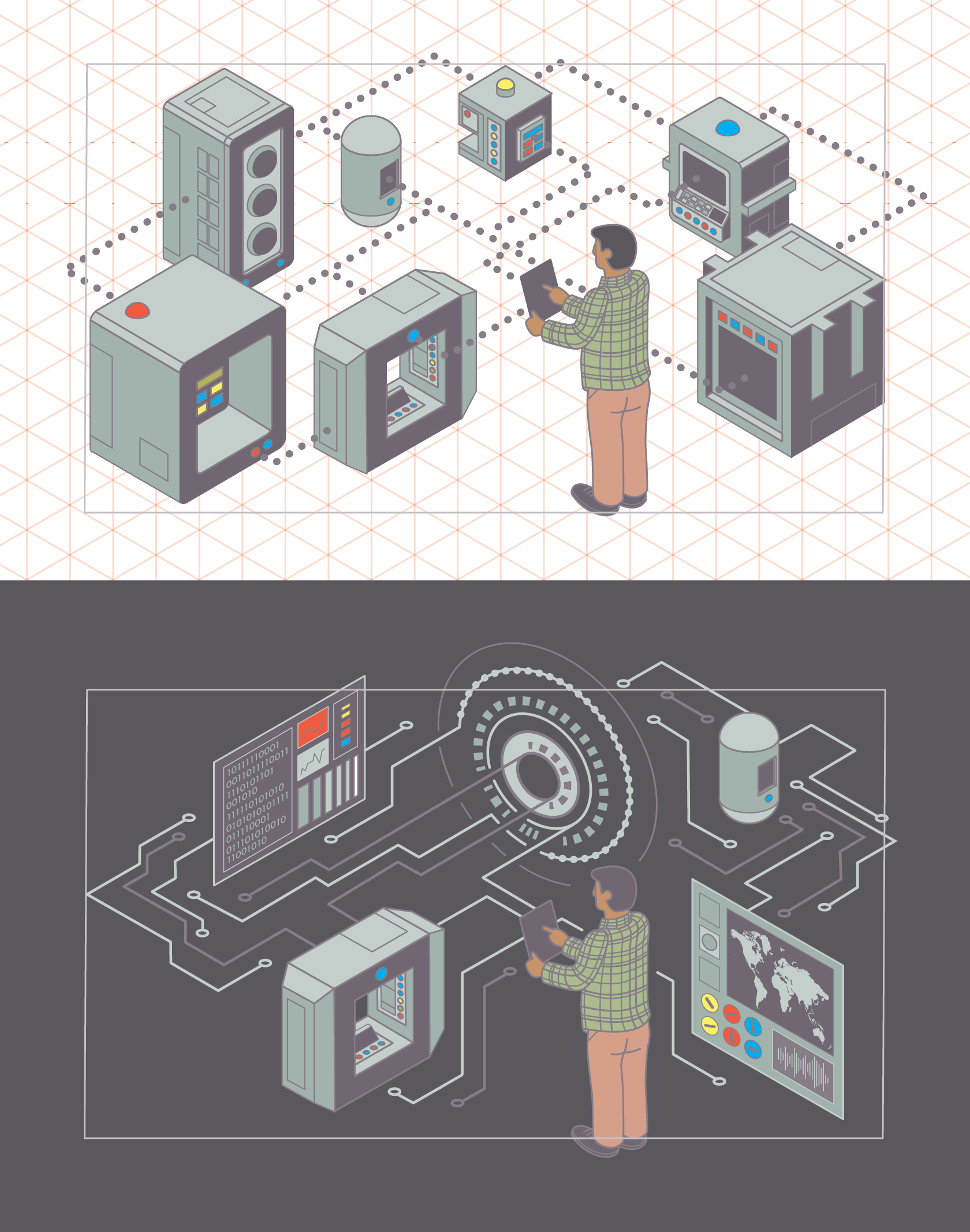
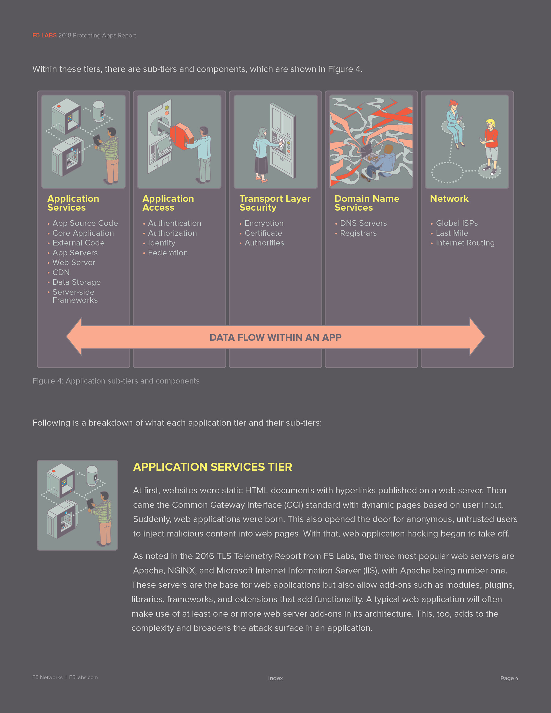
Breaking down the original graphic:
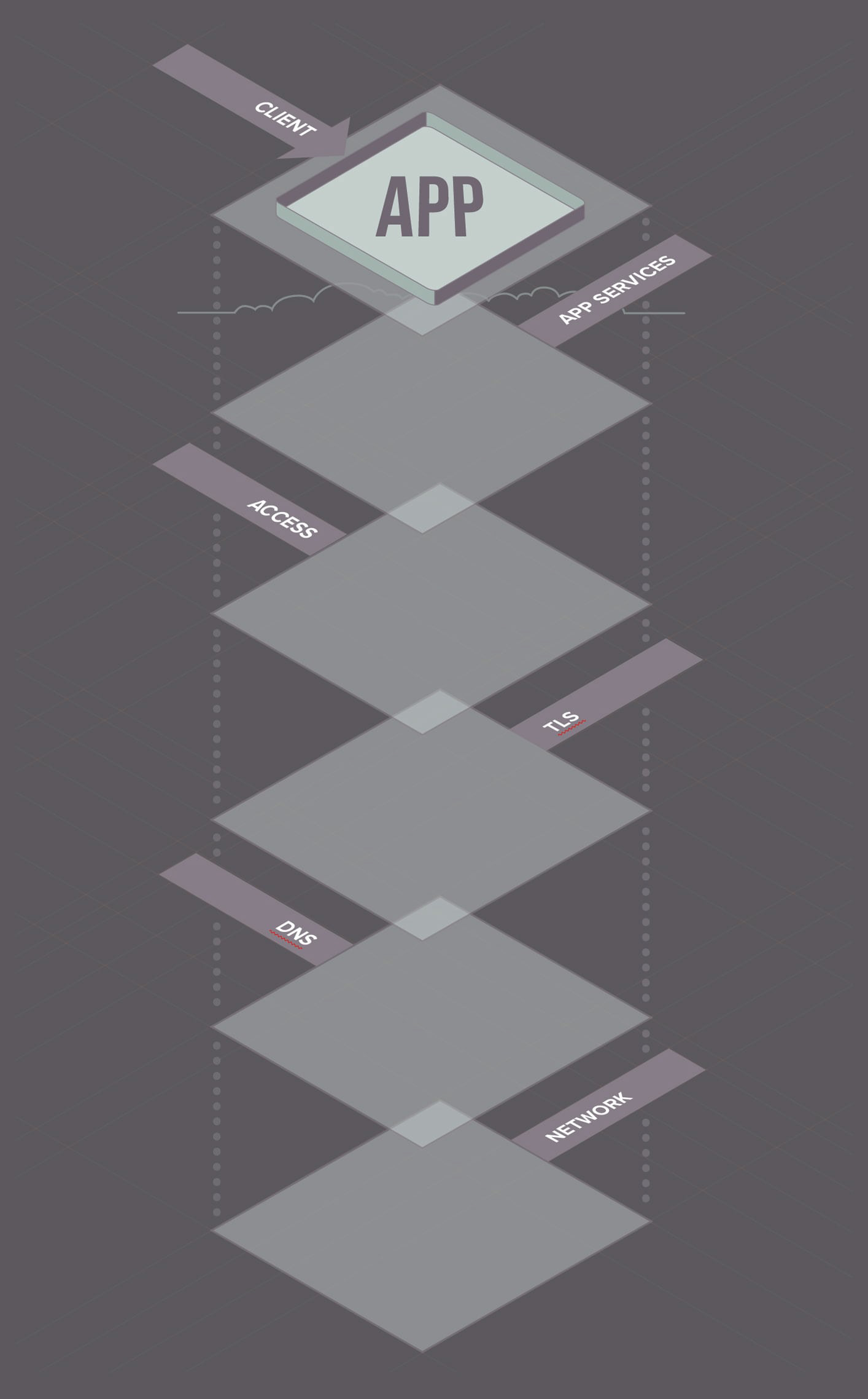
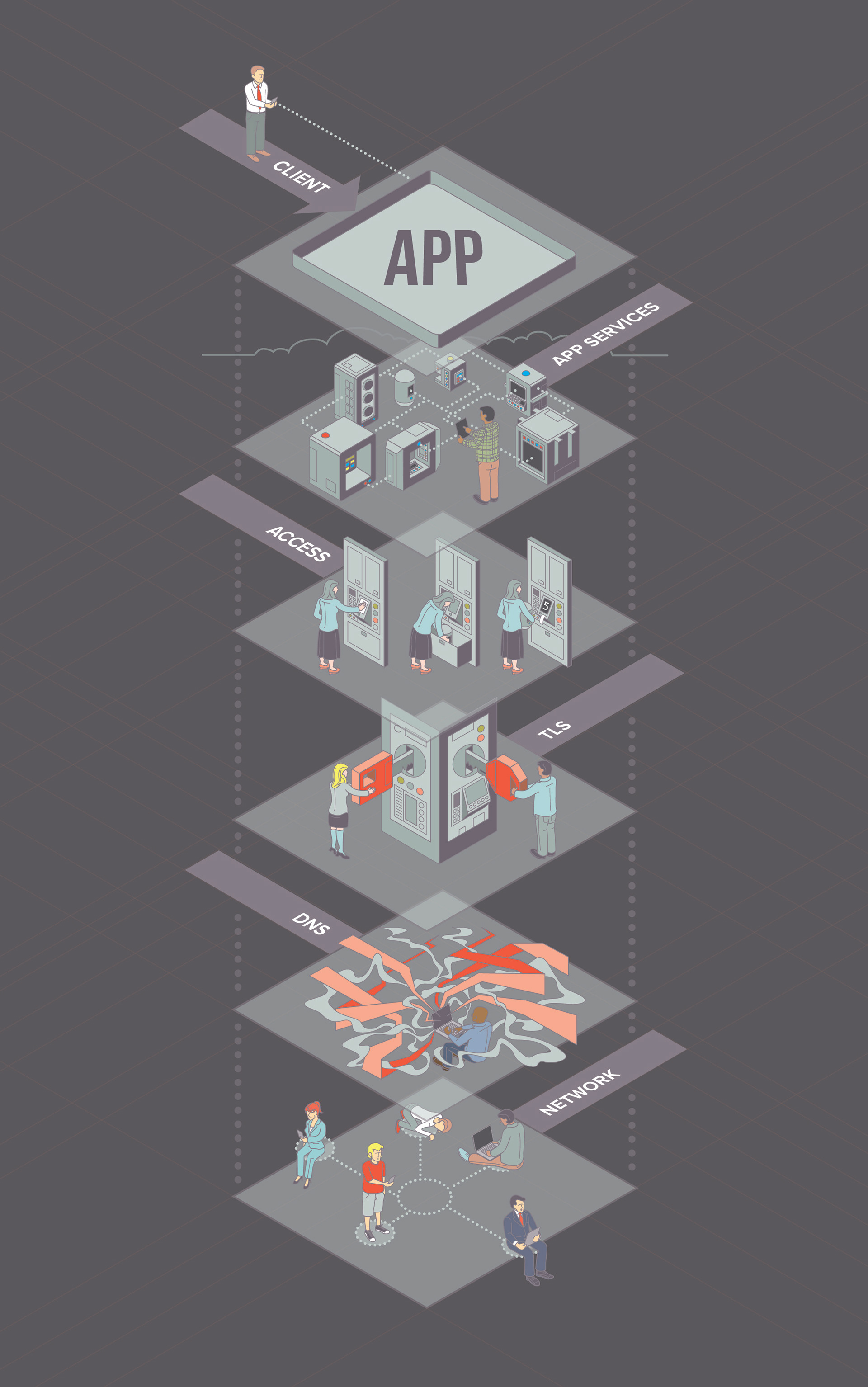
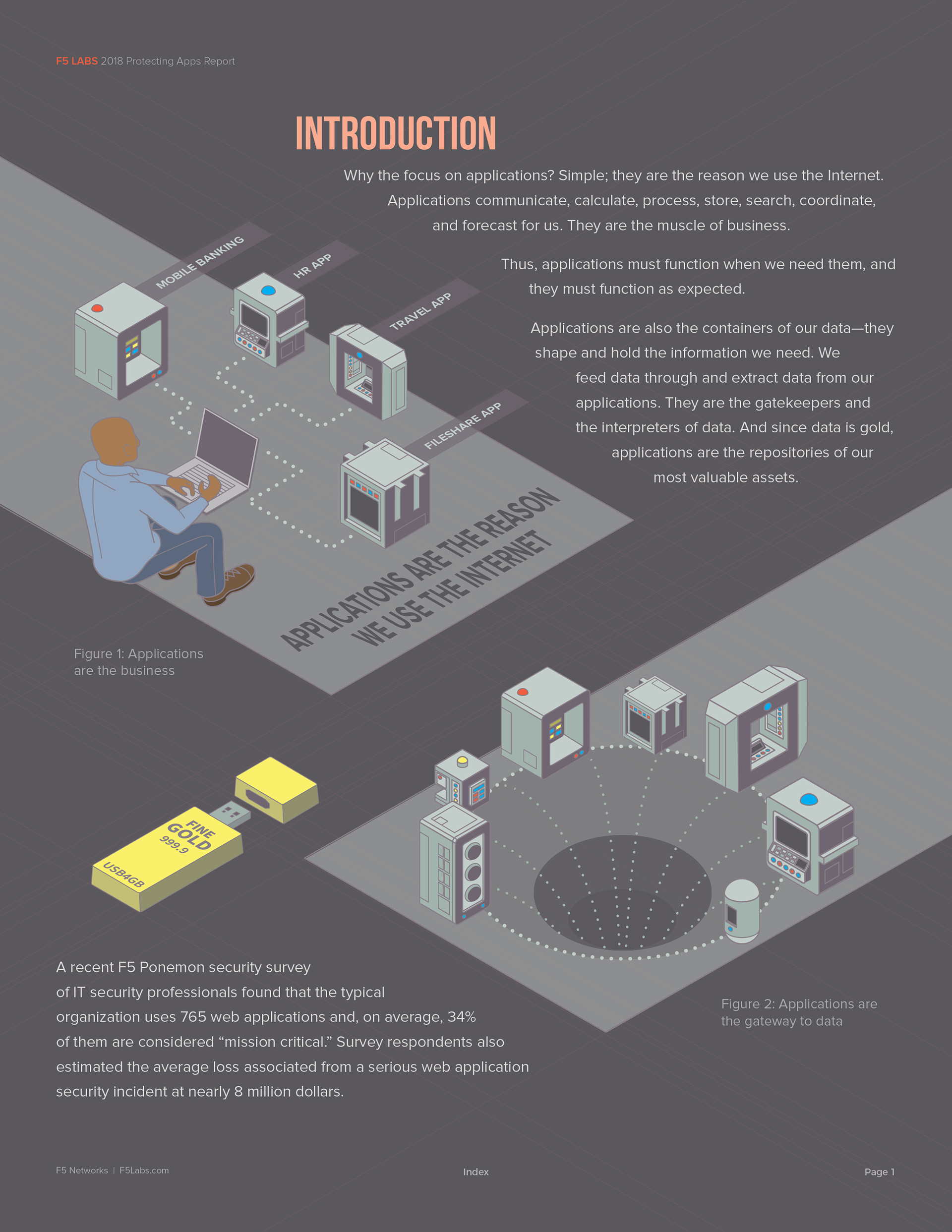
The client interacts with an app through their native operating system (OS). The app serves as the local interface for a wide range of services that exist in the cloud. A corresponding graphic details the kinds of attacks that occur at each tier.
Application Services — Software solutions that improve the speed, security, and operability of business applications.
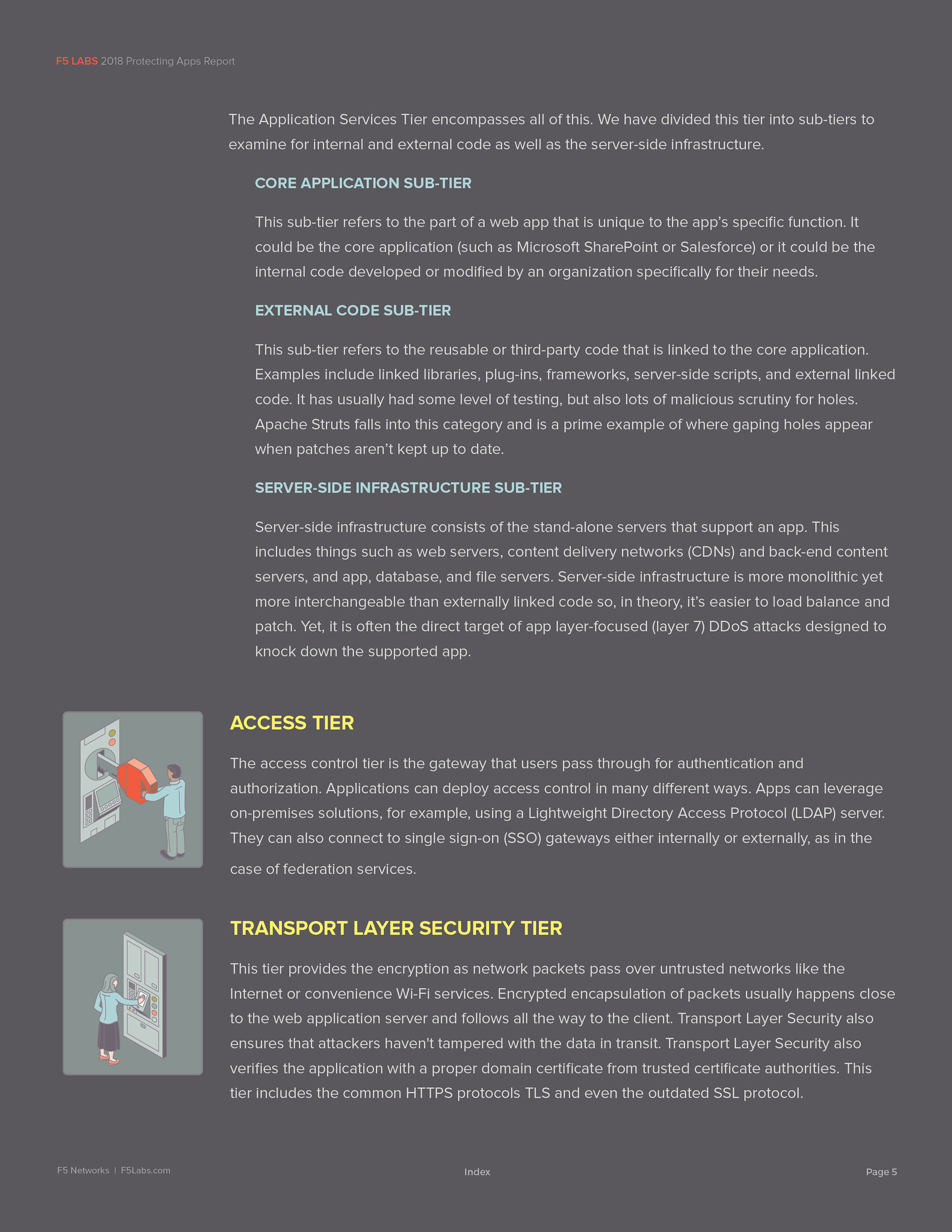
Access — The security layer governing how users verify their credentials to access an app, network, or system.
TLS (Transport Layer Security) — A standard internet protocol that provides authentication, privacy, and data integrity between two communicating applications.
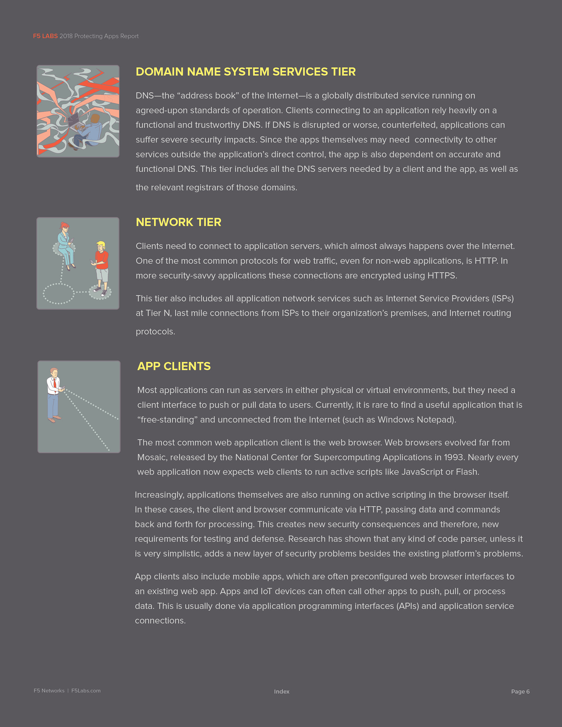
DNS (Domain Name System) — The internet's phonebook; the naming protocol that translates human-readable addresses into the routing information that makes web navigation possible.
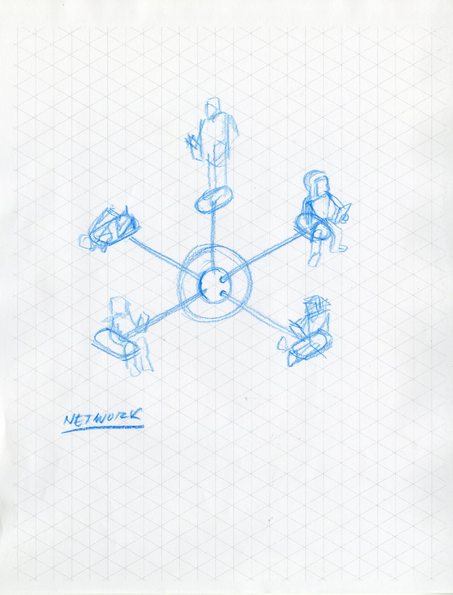
Network — The personal and business connections that exist online, along with the infrastructure that makes networking possible.
The Problem
The original graphic used simple icons to represent each tier, with a generic cloud graphic encircling the steps that reside in the cloud. The shortcoming was that the icons carried no meaning for anyone unfamiliar with the underlying concepts — leaving the graphic dependent on lengthy supporting text or a sales pitch to land with new prospects. In practice, that's exactly what was happening.
Concept
Early thinking centered on revising the graphic into a traditional infographic — breaking the tiers into labeled sections supported by copy. It was a reasonable approach, but one that would have been a hard sell to stakeholders. Instead, I wanted to retain the basic layout of the original graphic while significantly expanding how it communicated.
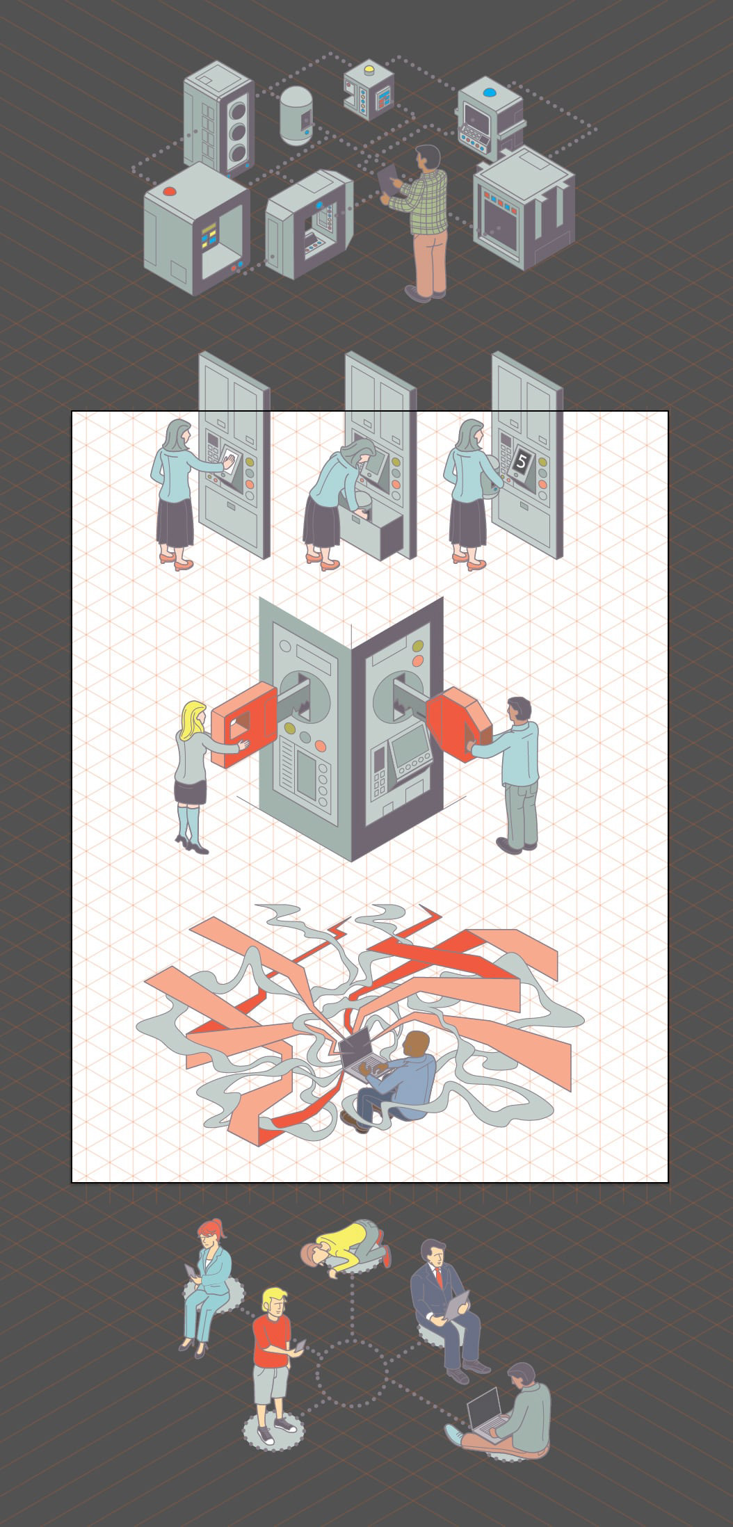
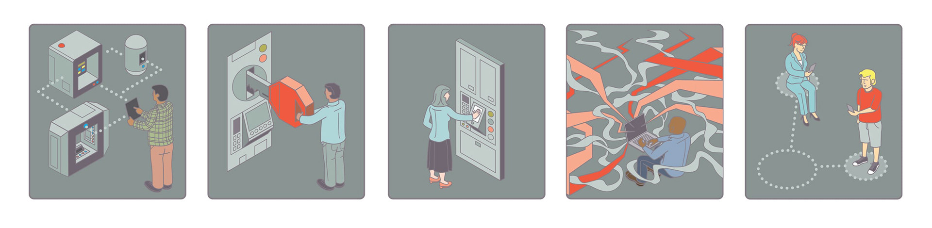
My proposal was a hybrid between an infographic and an editorial illustration: isometric scenes depicting each tier as its own vignette. Beyond working together as a unified graphic, the individual pieces could be extracted and repurposed in simpler formats for different contexts. This approach also gave me room to layer in detail that would do the explanatory work on its own — no supporting text or sales pitch required.
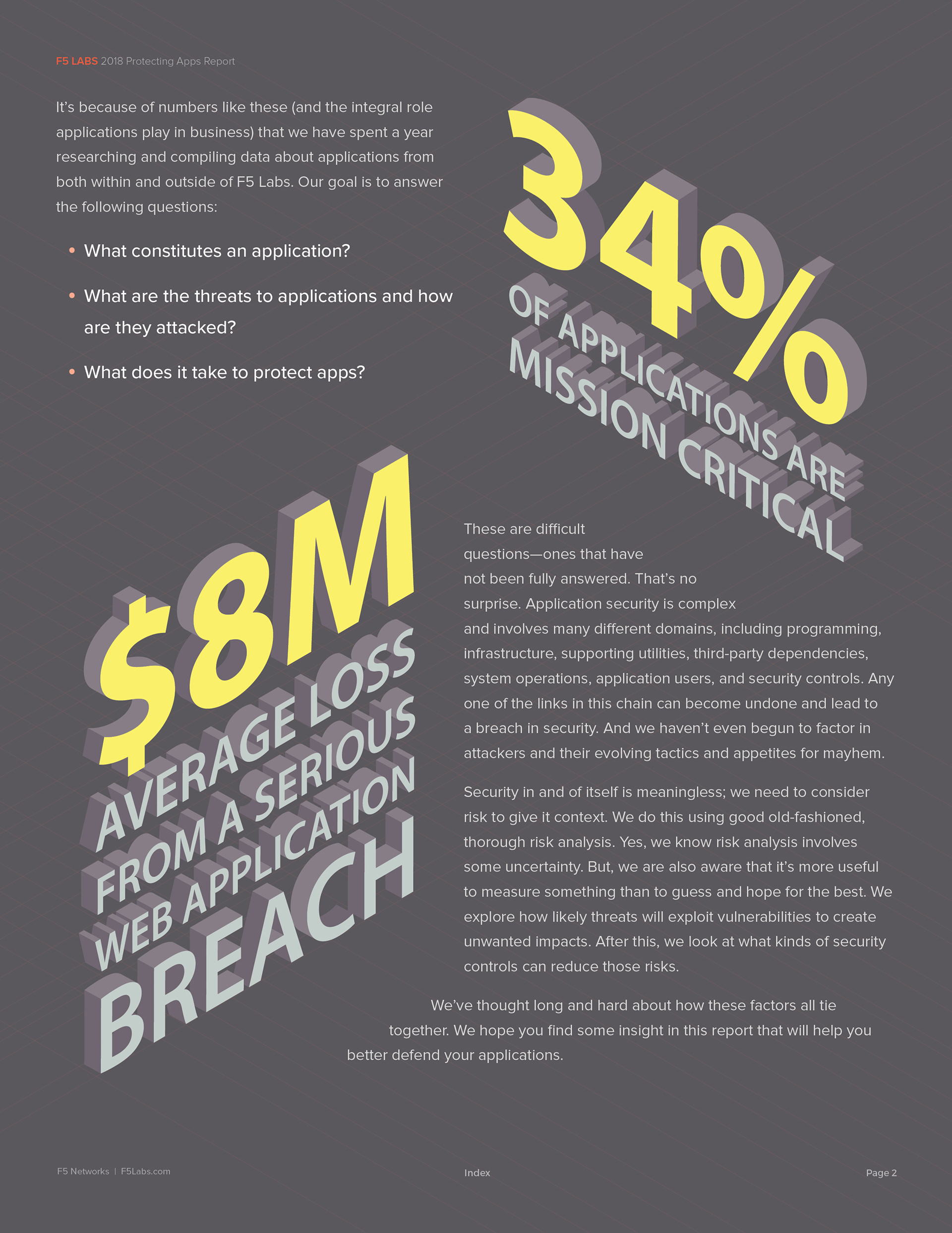
One idea from early team discussions stuck with me: that an "app" is really nothing more than a façade — a container. This concept was actually reflected in the original graphic, though not as literally as I wanted to take it. The metaphor I leaned into was that of a building, where each tier represents a floor — a distinct component that can be swapped out, upgraded, or replaced independently, much like the modular way software and systems are actually built.
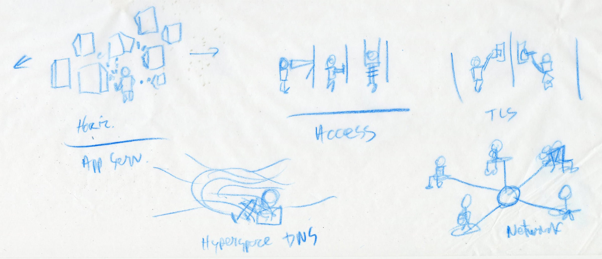
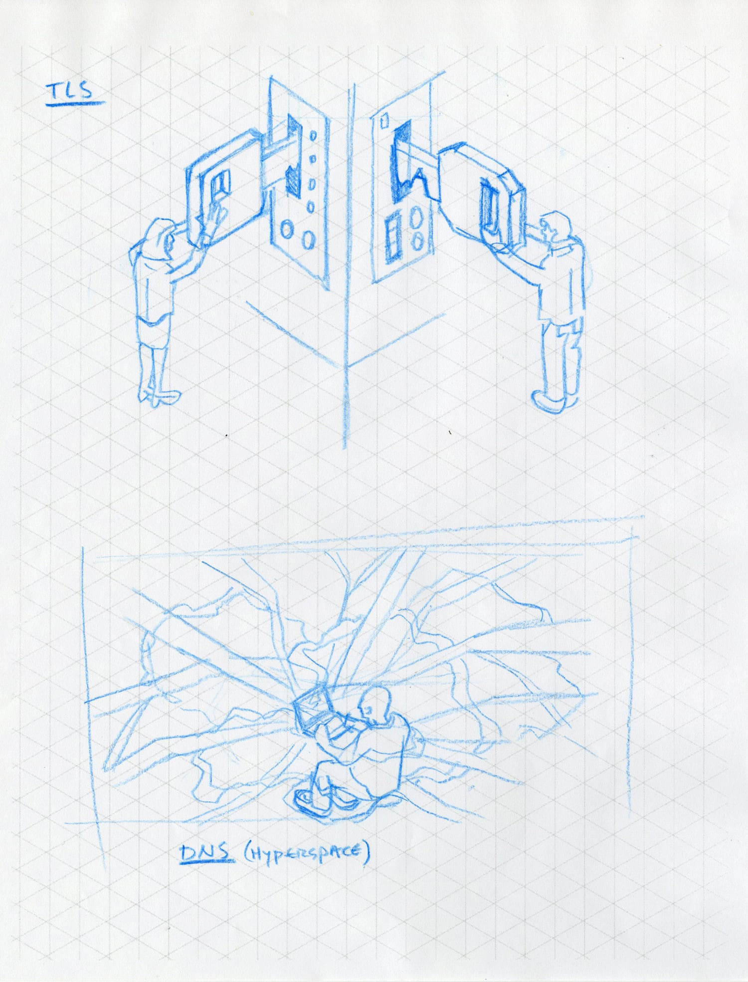
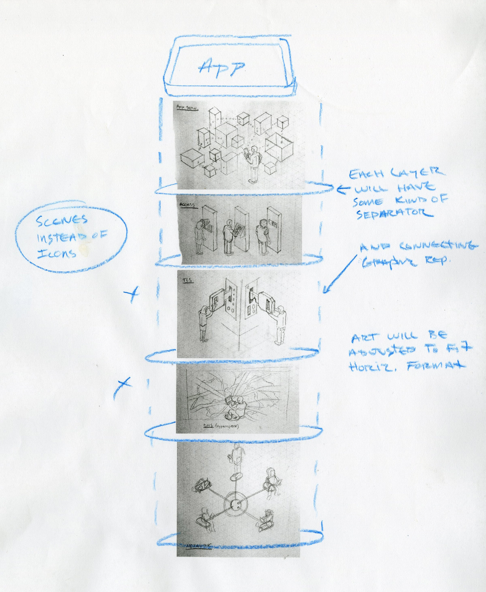
With the concept approved, I began by breaking the illustration into sections to facilitate the drawing process, starting with the exploded tiered view of the structure.
Each vignette aims to paint a clear picture of what is actually happening at that level, using figures to help the viewer make an emotional connection with the process.
Visual Style
The goal was to strike a balance between realism and illustration — detailed enough to convey complexity, but stylized enough to keep it visually engaging. The style needed to feel technical, align with the corporate brand, and have enough personality to stand on its own.
The color palette was derived from F5's existing brand colors, but pulled back slightly to give the illustration more versatility across different marketing contexts.
Solution
The final illustration expands on the original graphic by transforming a static image into a storytelling device. Each tier is brought to life through a figure and a scene, conveying visually what previously had to be explained verbally.
The Client interacts with an app, transmitting data to the cloud where any one — or combination — of five processes takes place:
Application Services — A figure works to improve the speed, security, or operability of a business application within a server environment.
Access — A figure authenticates via a palm scanner, retrieves data from a drawer, and receives a receipt confirming the transaction.
TLS — Two figures authenticate security protocols across a pair of terminals.
DNS — A figure navigates the internet, representing the translation layer that makes browsing possible.
Network — Figures interact across a connected network, visualizing the infrastructure that links them.
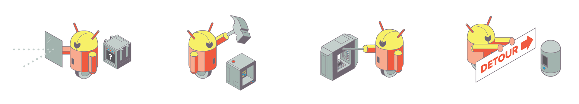
The final layout maps the specific types of attacks that can occur at each tier.
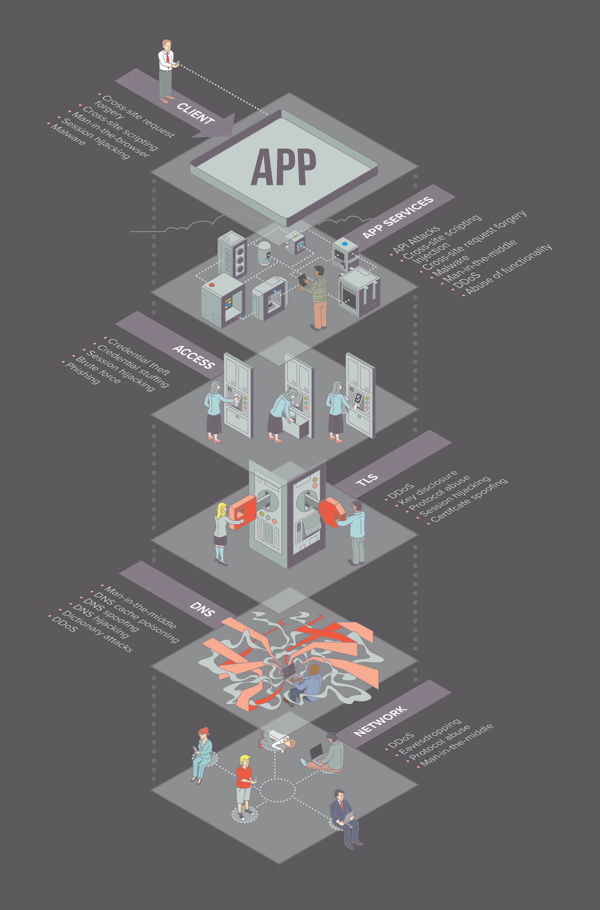
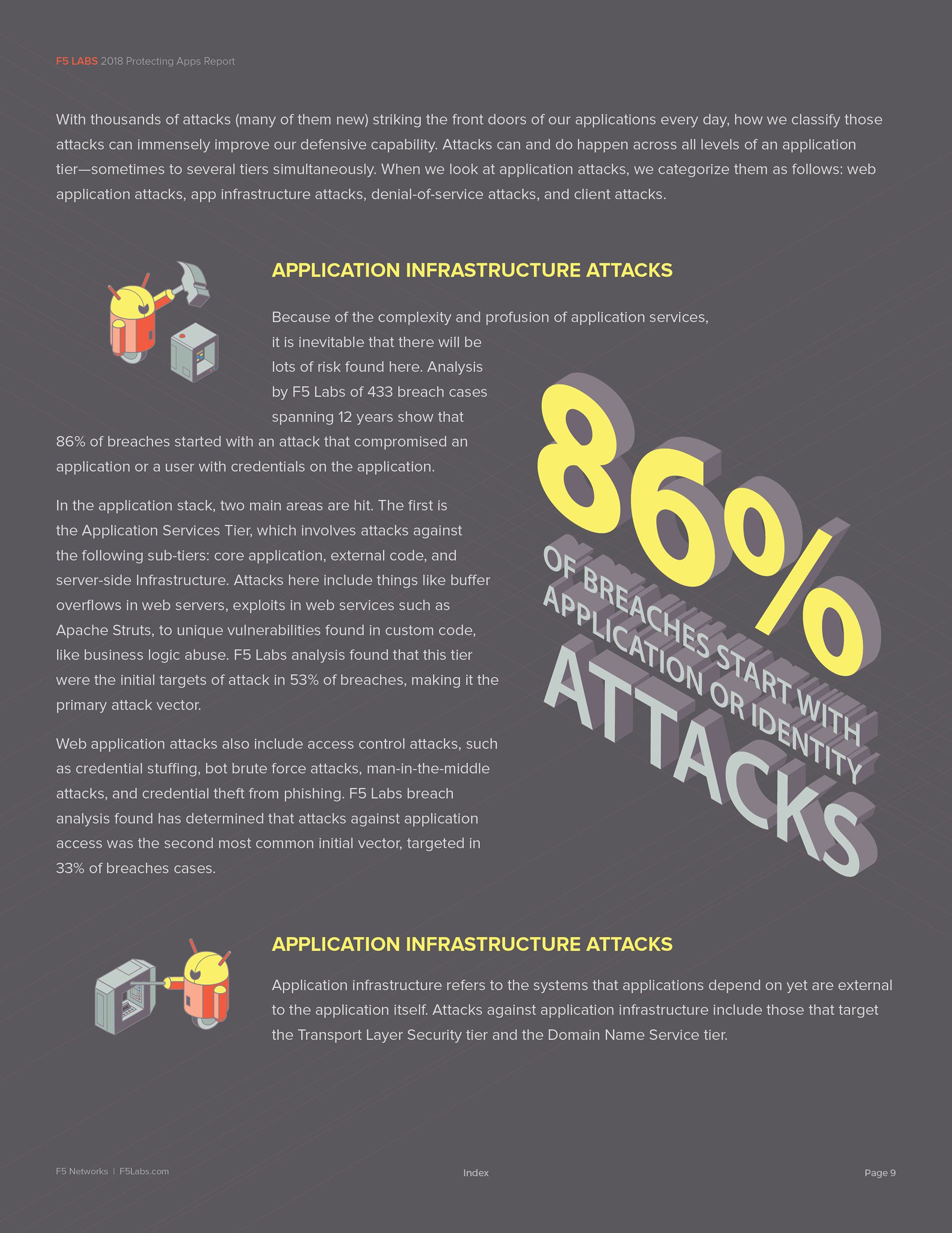
Each attack type is personified as a bot, visually depicting how it targets an app or system.
Report
The intro section layouts incorporate all supporting artwork and design elements created to complement the copy.
Outcome
This version represents some of my proudest work, though it wasn't the final iteration that was approved and published. The artwork I eventually created found its way into nearly every aspect of F5's branding and marketing — from their website and print materials to framed pieces in corporate headquarters, a touchscreen welcome presentation for new clients, their trade show booth, and even t-shirts for their Asia-Pacific division.